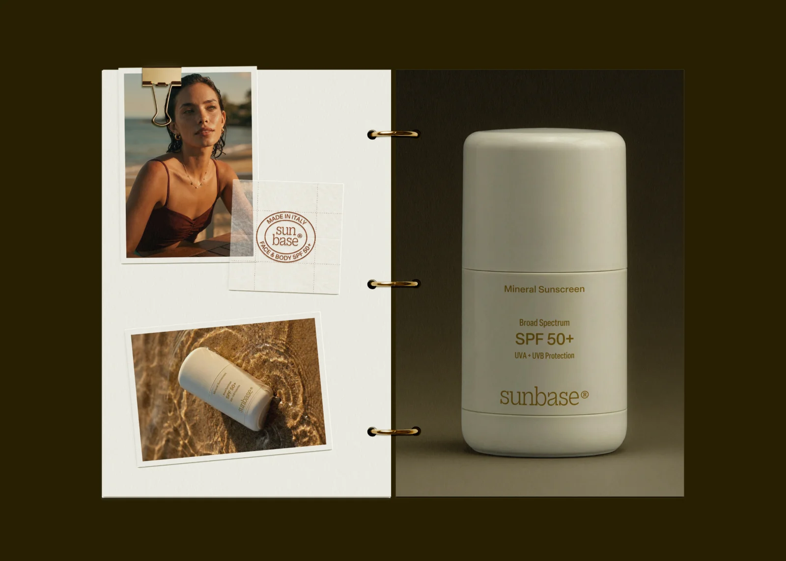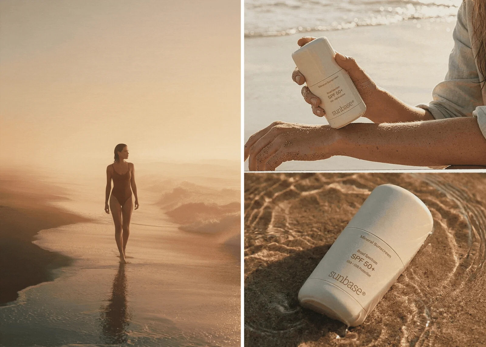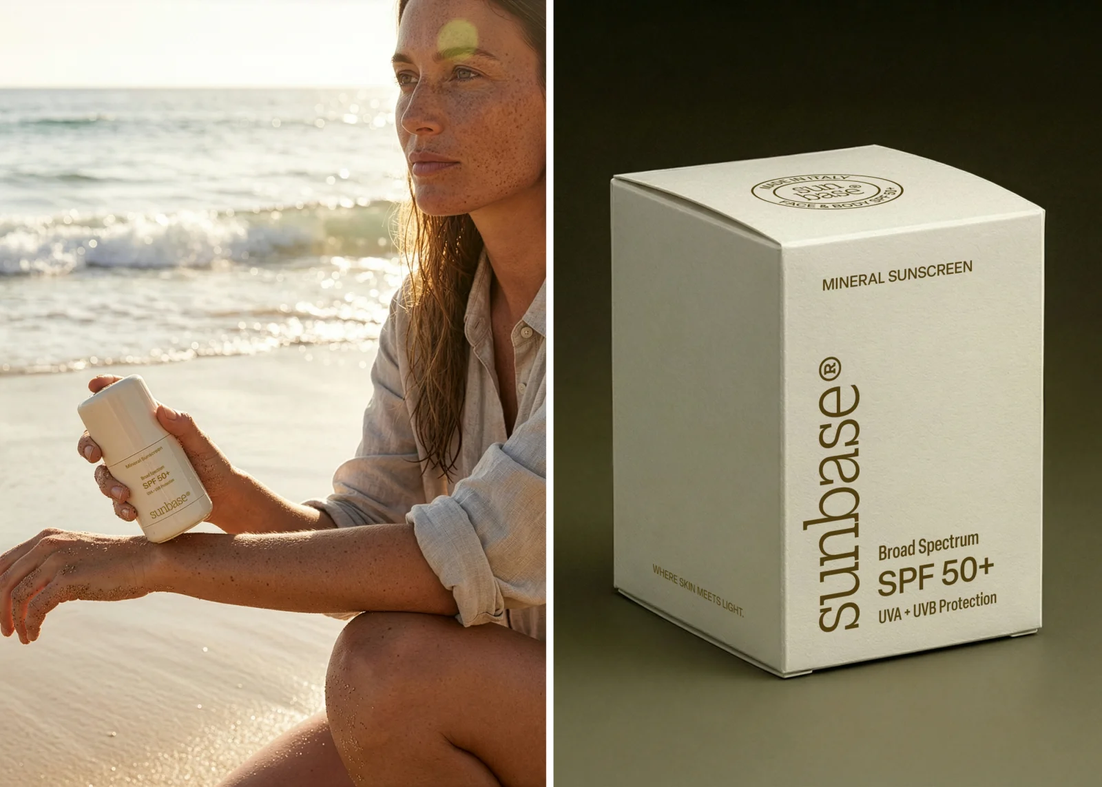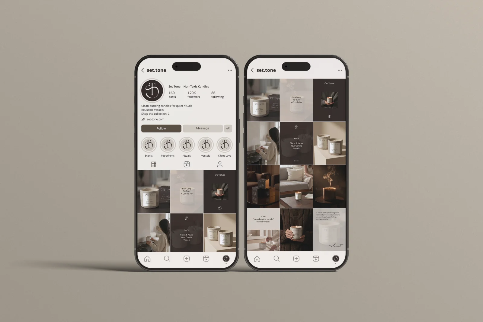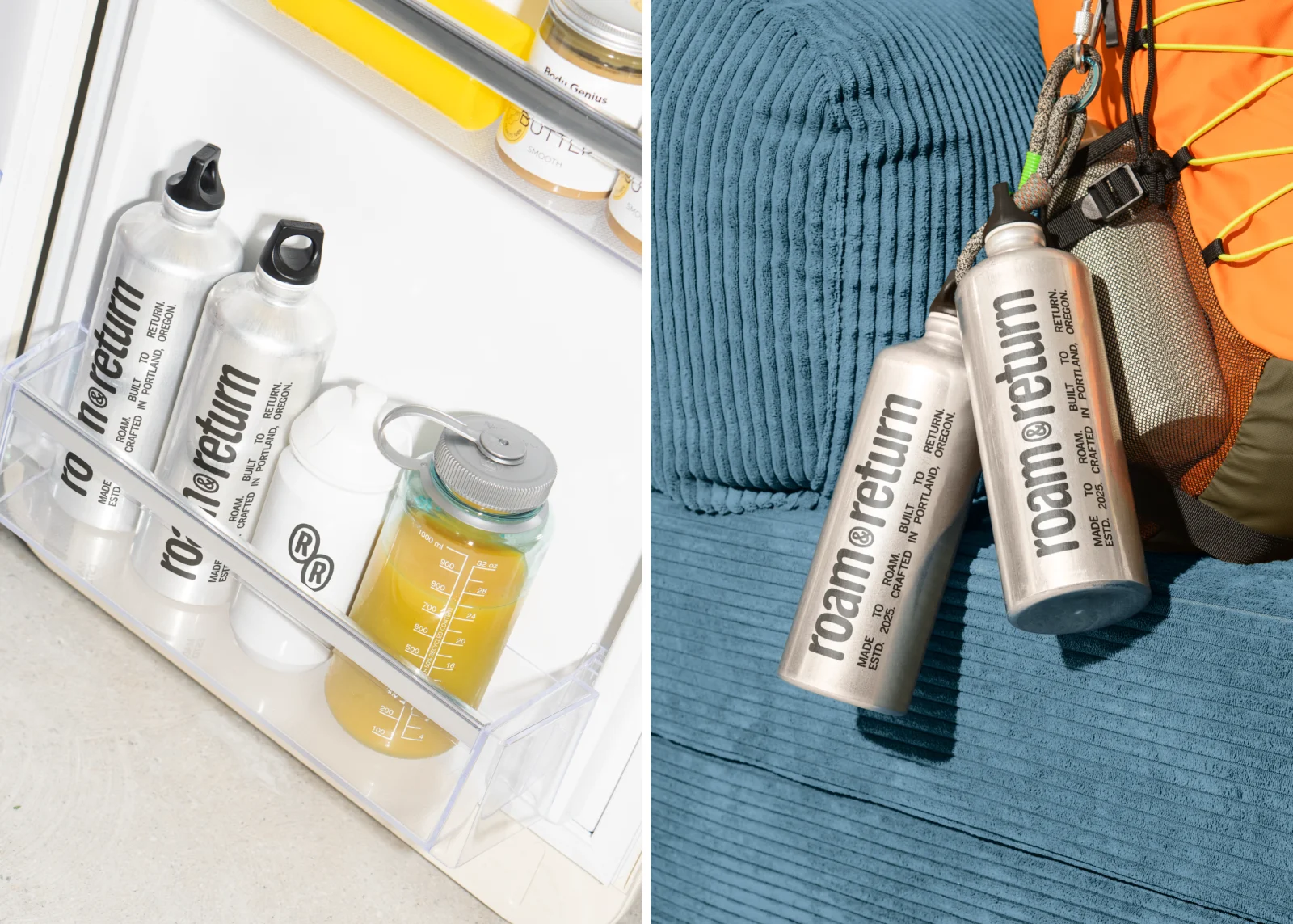
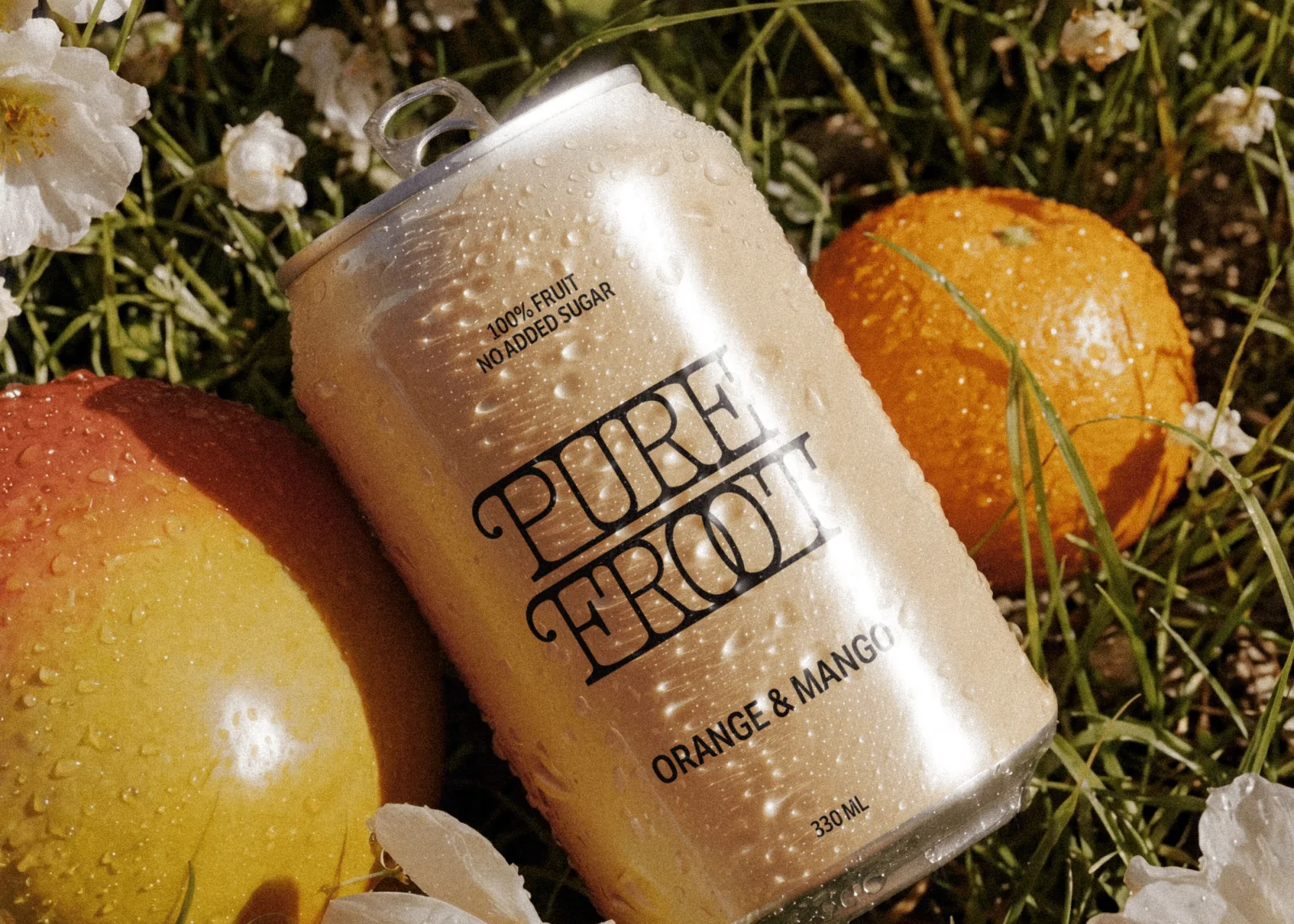
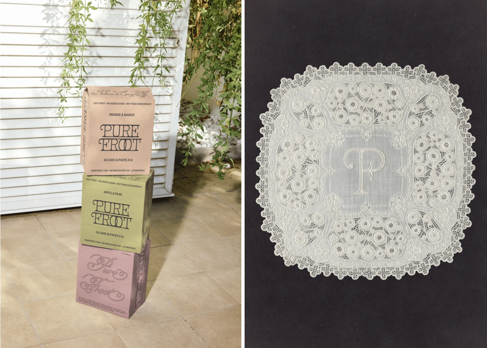
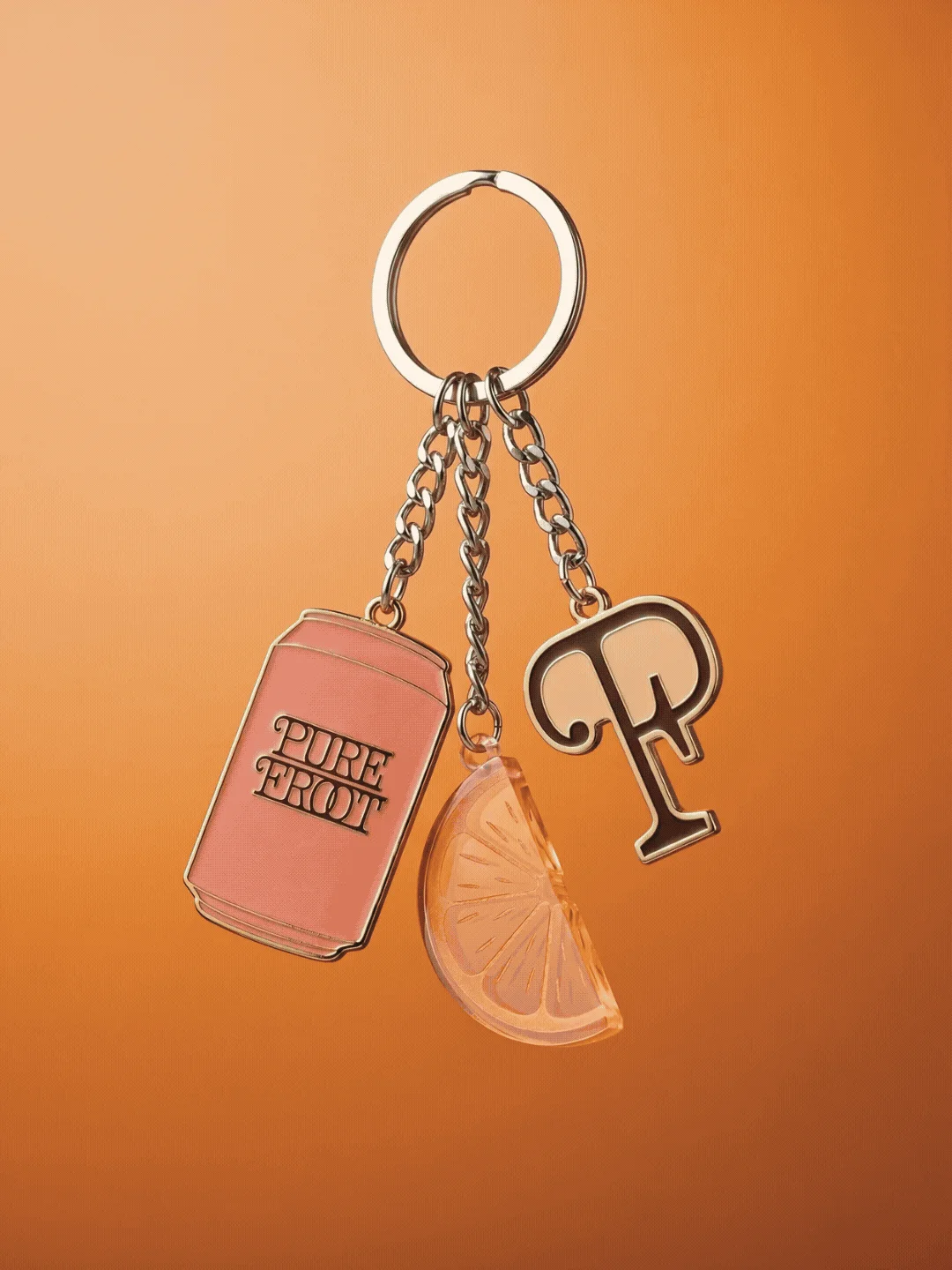
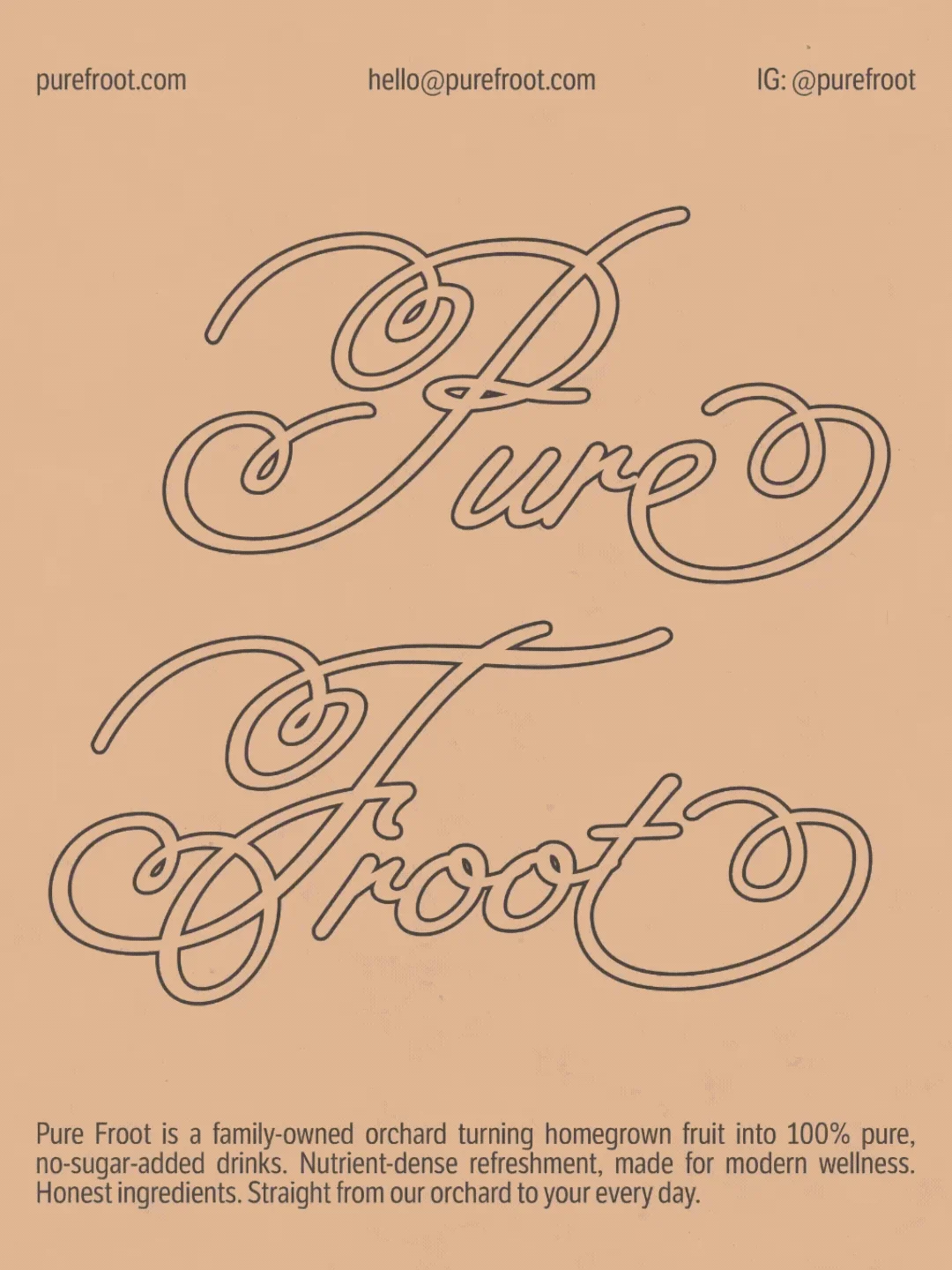
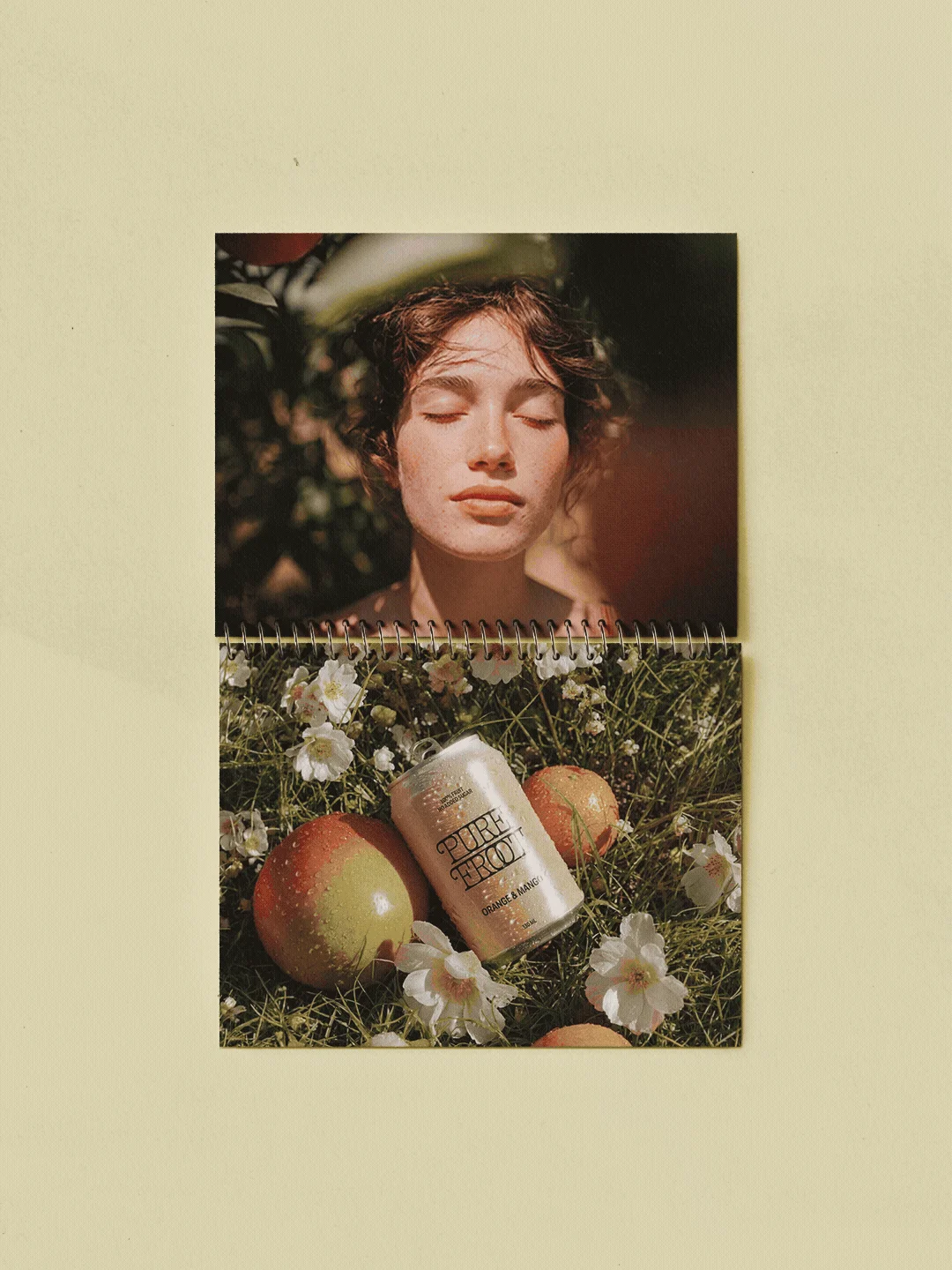
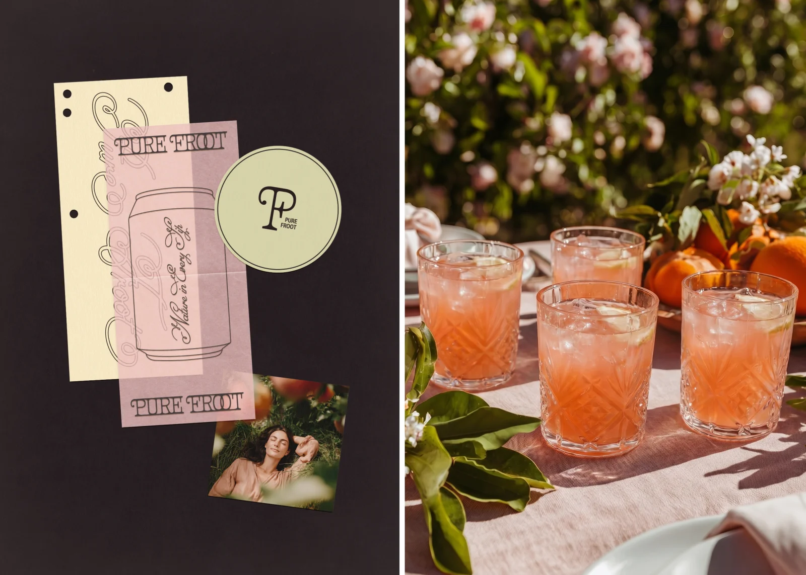
Pure Froot | Organic Juice Brand Identity | Can Design
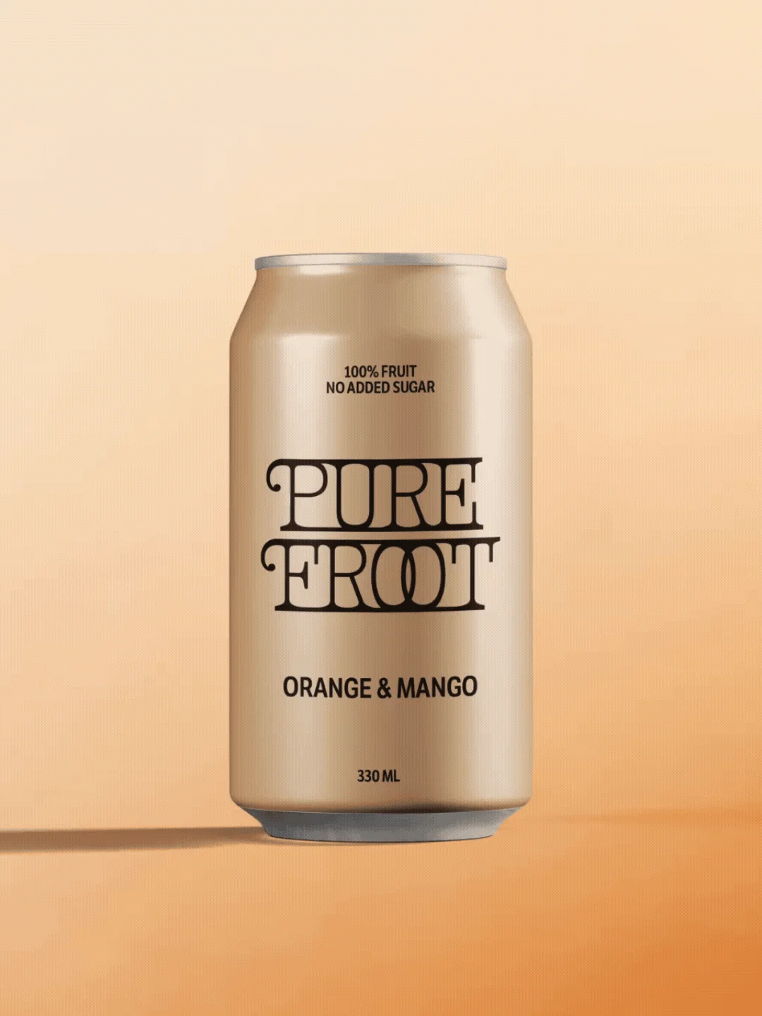
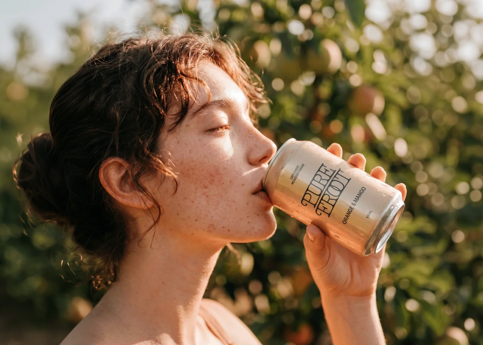
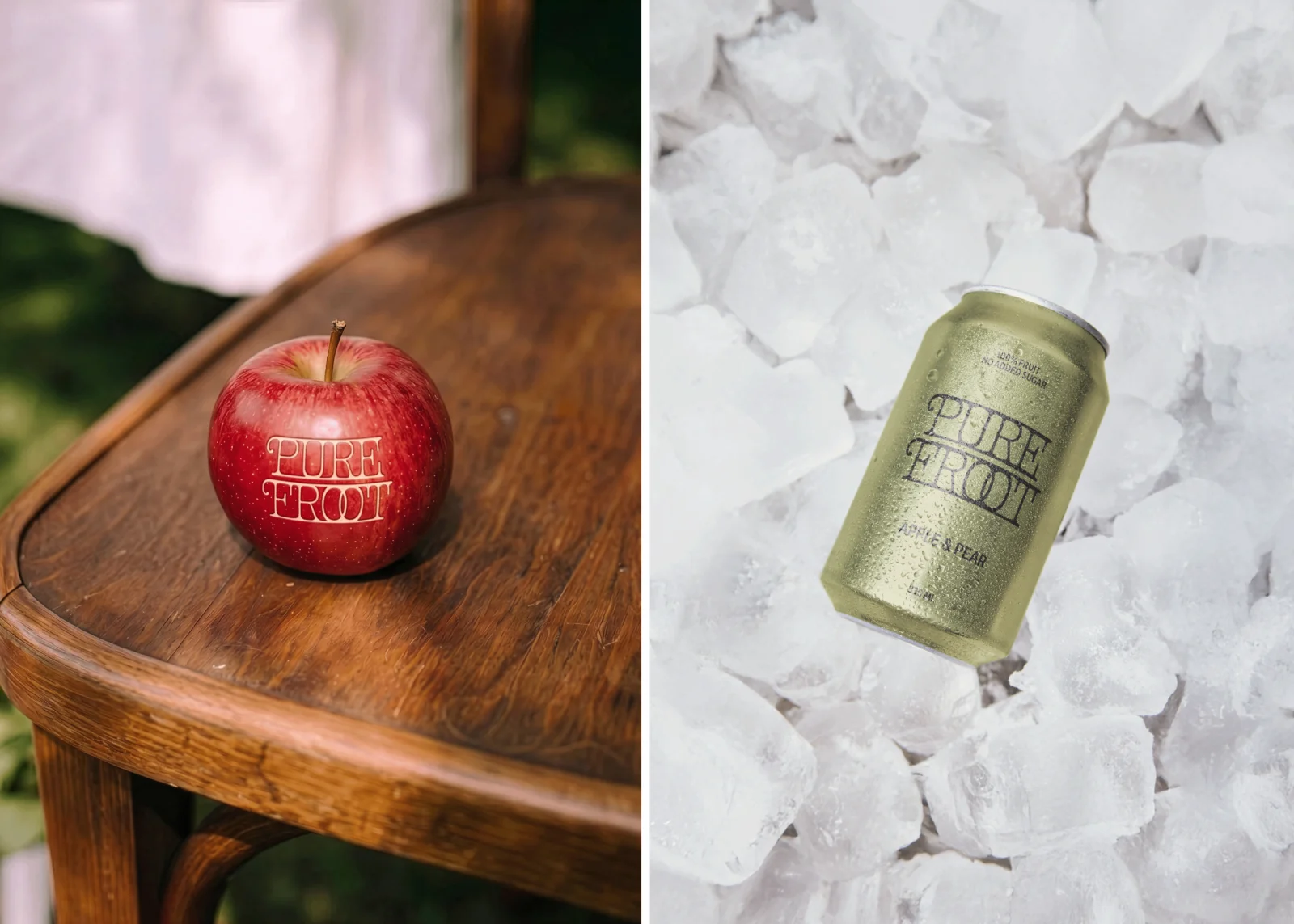
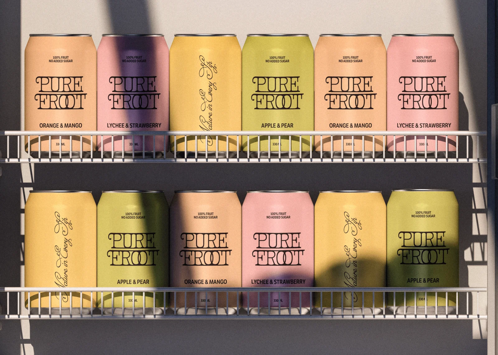
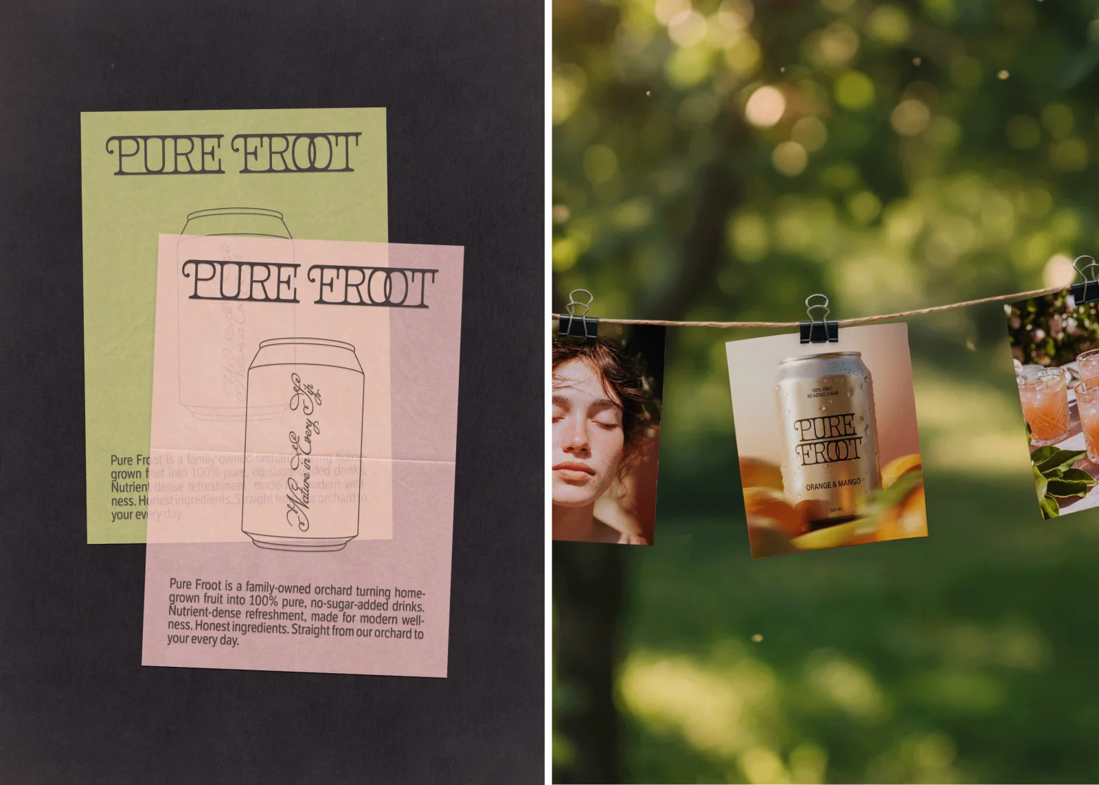
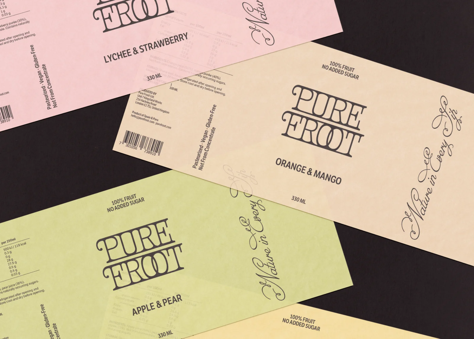
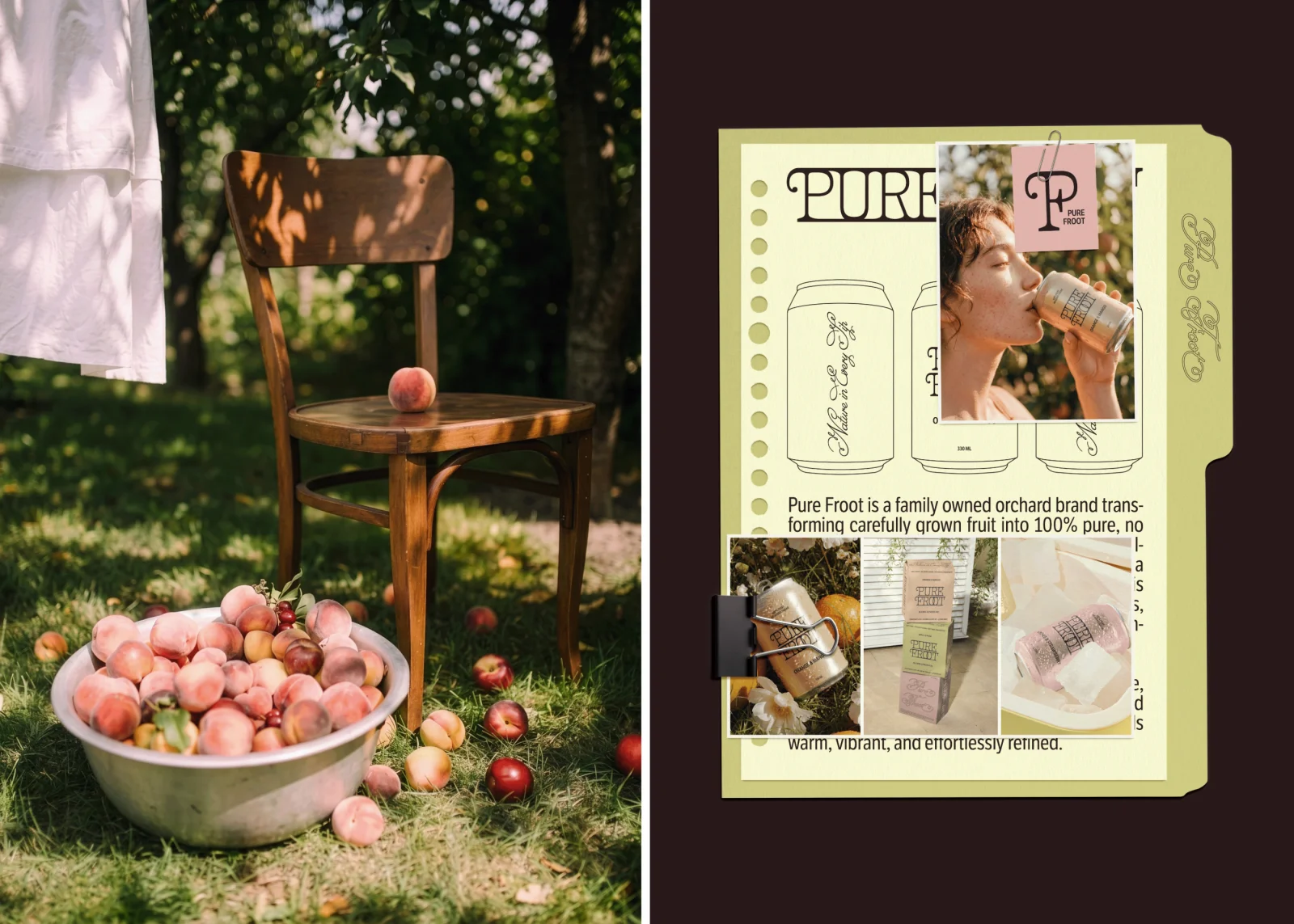
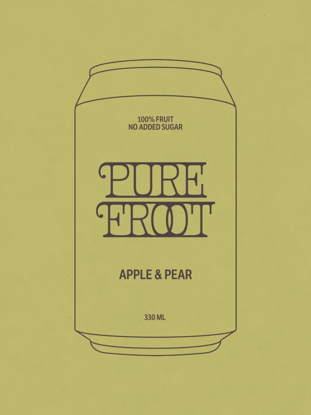
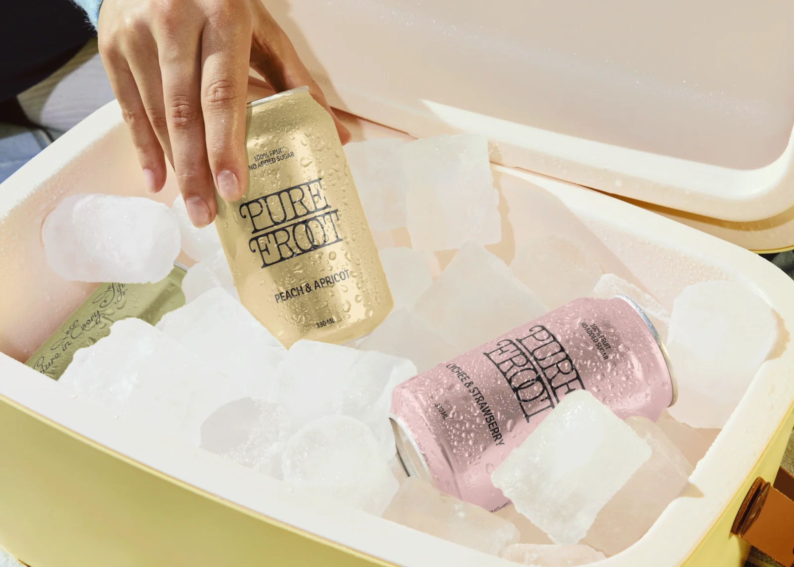
Pure Froot is a family-owned orchard turning homegrown fruit into 100% pure, no-sugar-added drinks. Honest ingredients, straight from the orchard to your every day. The wordmark takes its shape from vintage iron fencing, the kind of curled, looping metalwork you find around old gardens and orchards. Those forms carry into a hand-drawn script ("Nature in Every Sip") that softens the whole system. The palette stays muted and sun-washed: peach, sage, lychee pink, butter yellow. Each flavor gets its own tone without breaking the line. Packaging keeps things quiet. Matte cans, minimal copy, and generous space let the typography and color do the work. Secondary materials extend the same restraint: paper-stock cartons, coasters, hangtags, and editorial-style print collateral shot in natural light. The result is a small-batch juice brand that feels grown rather than manufactured. Calm, considered, and rooted in the orchard it comes from.