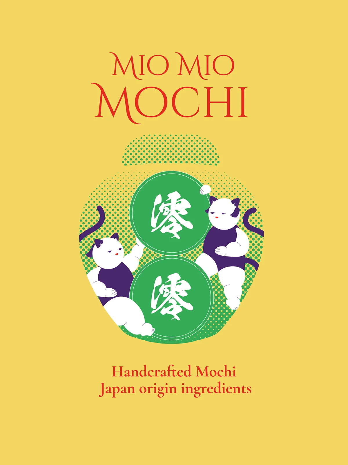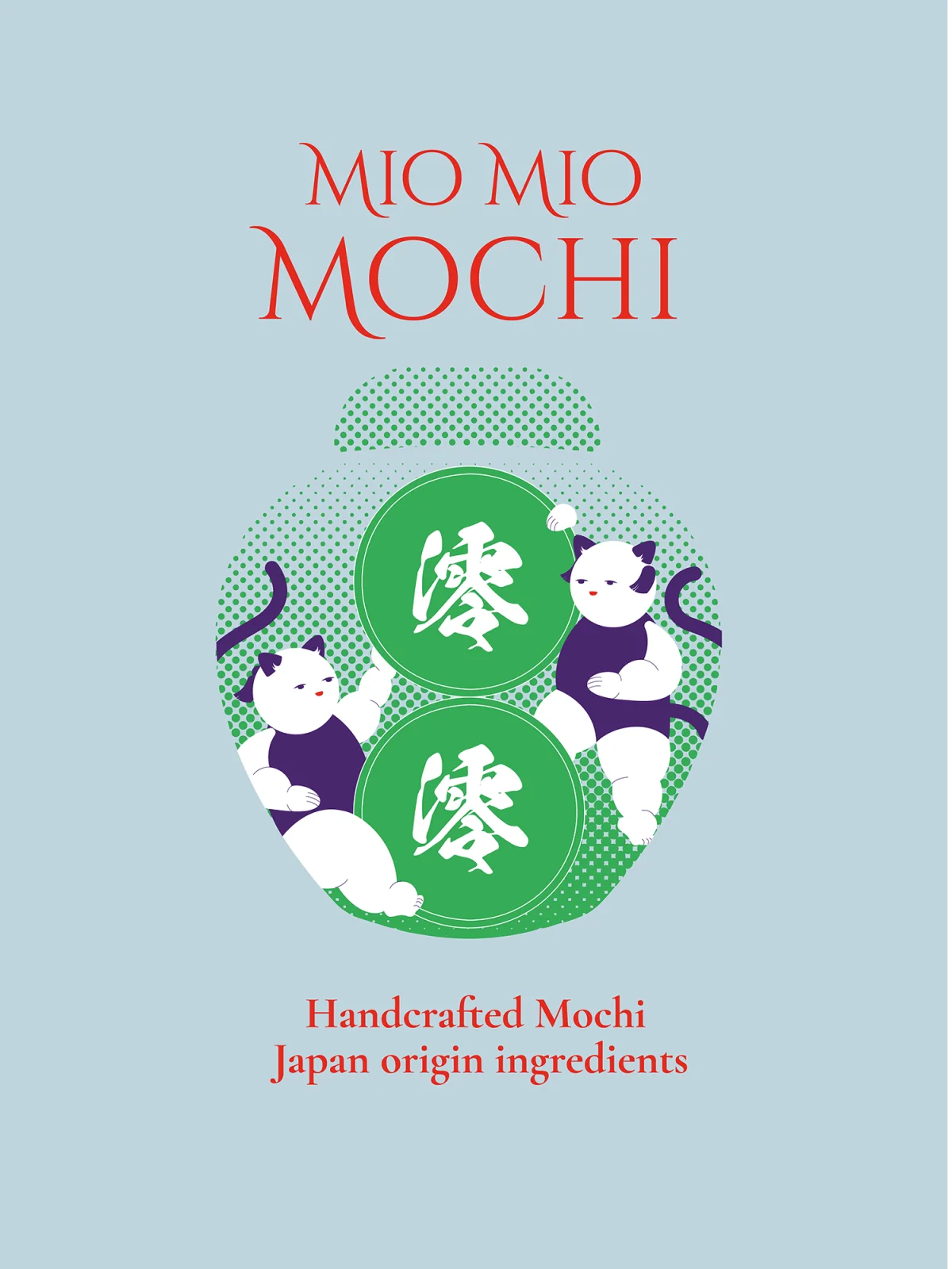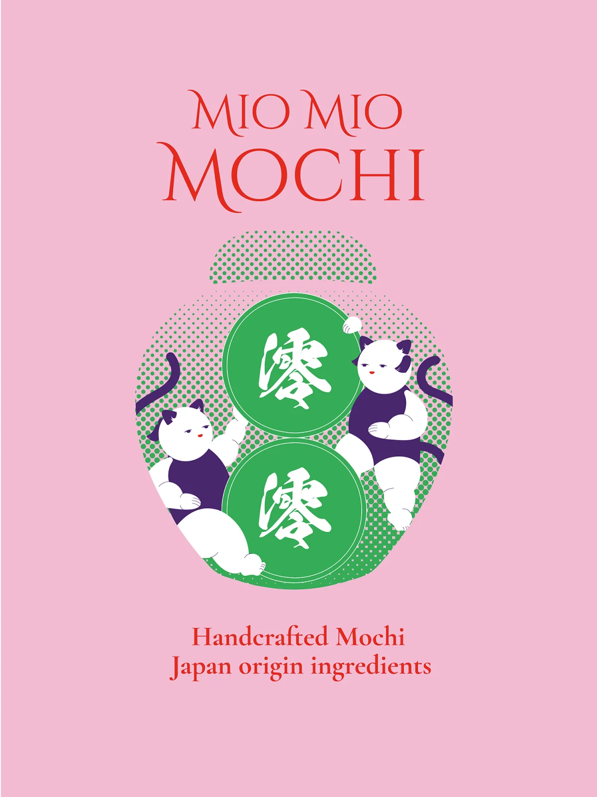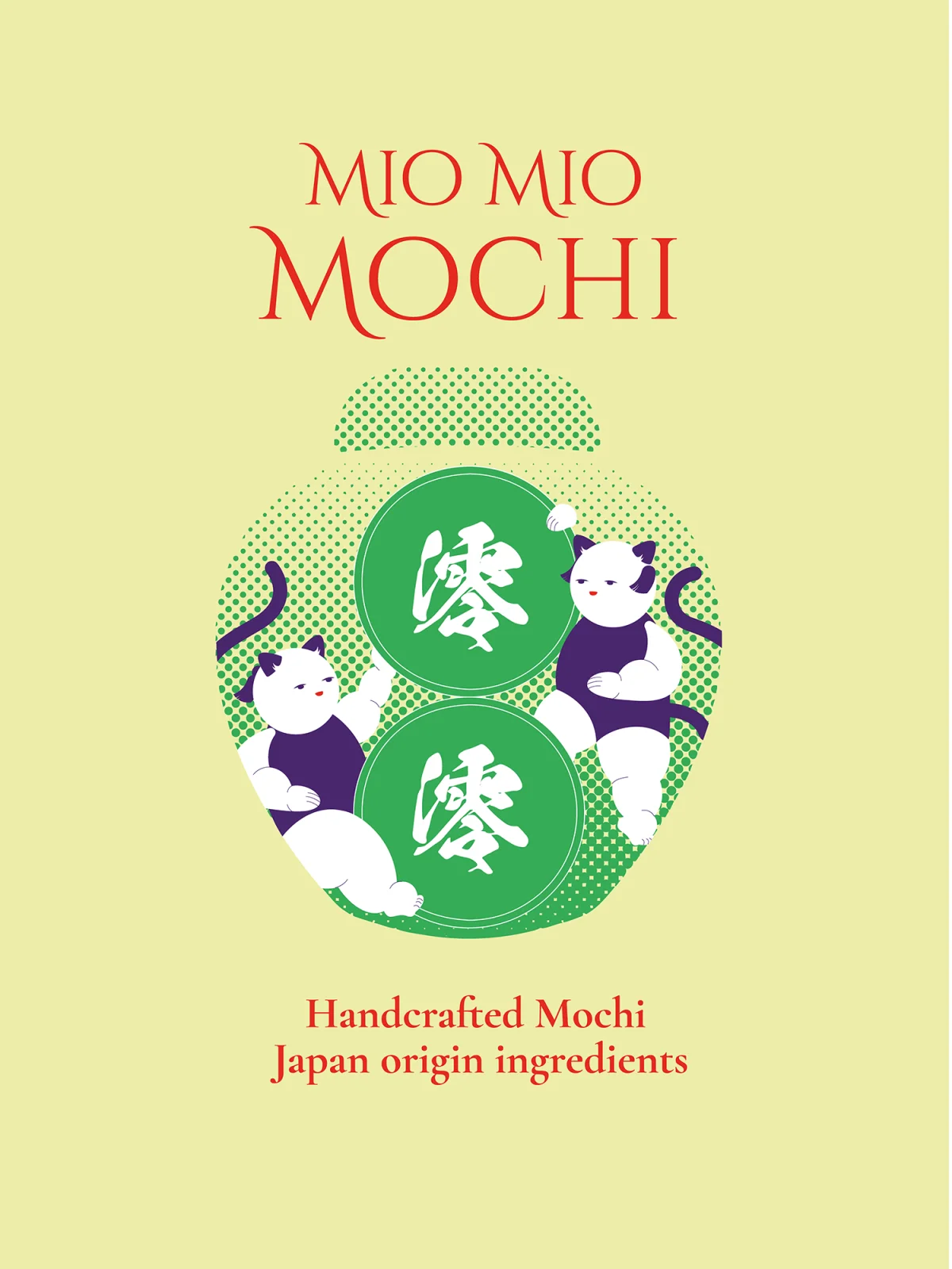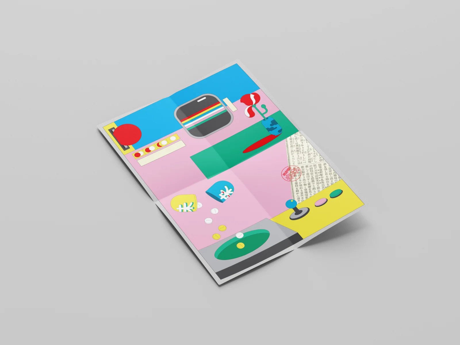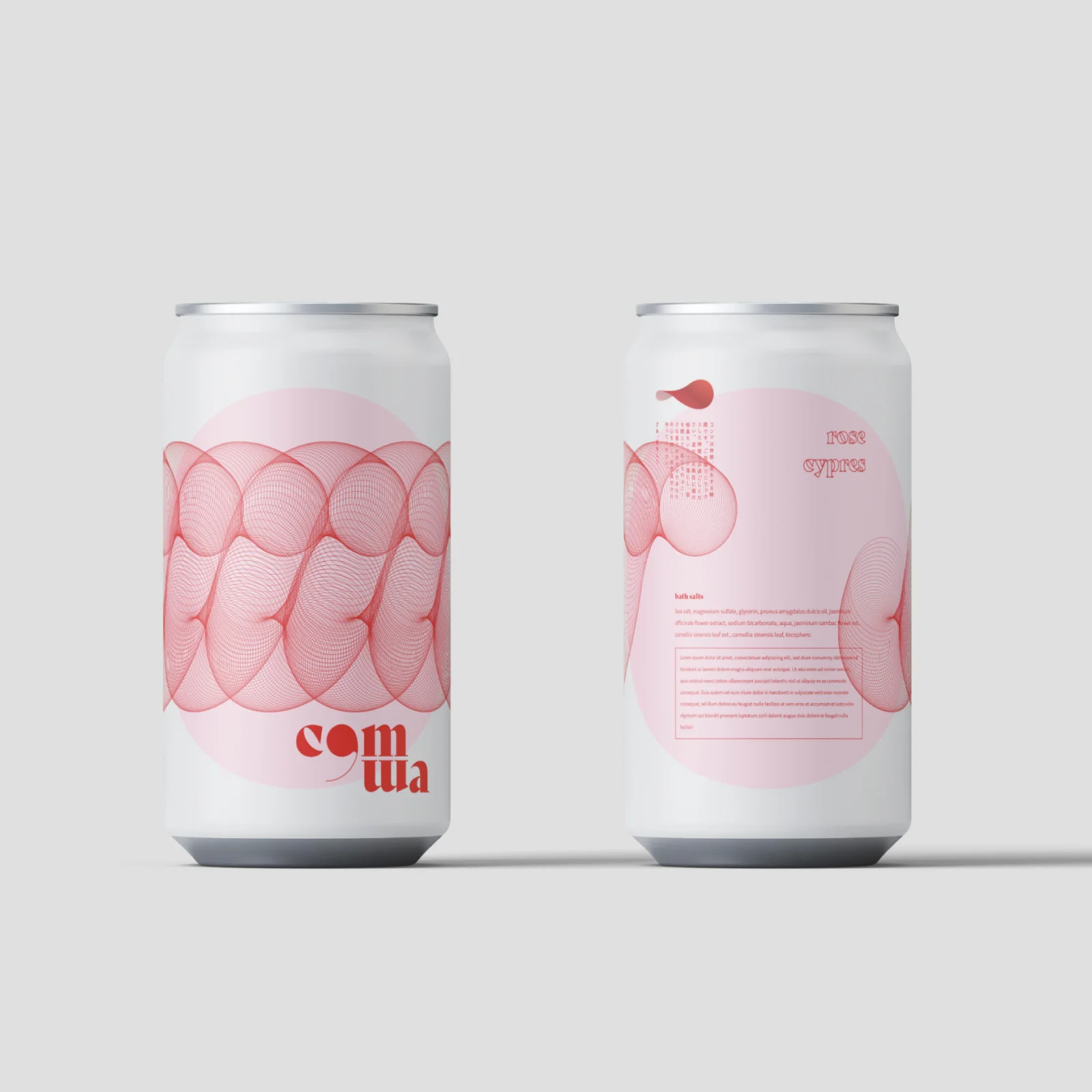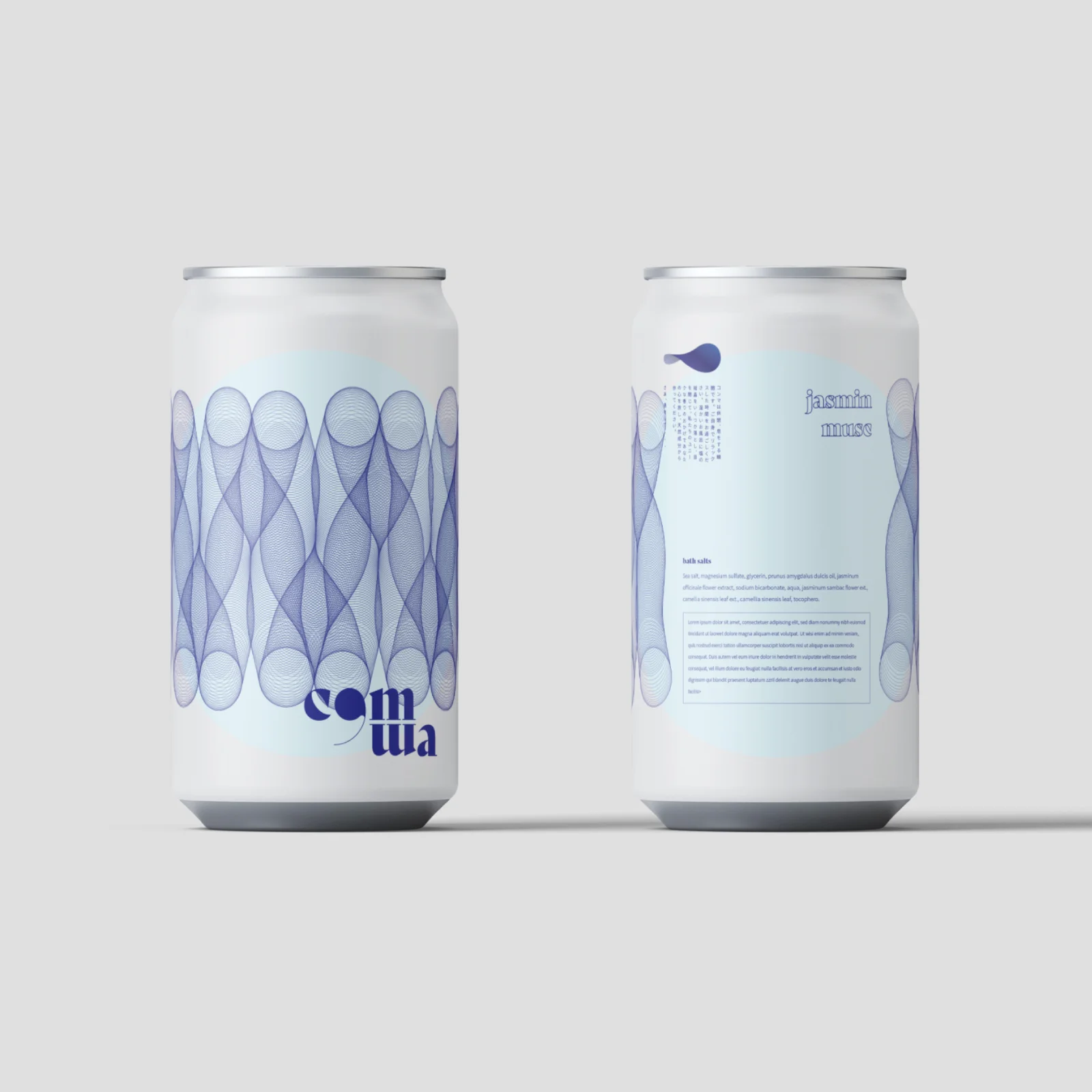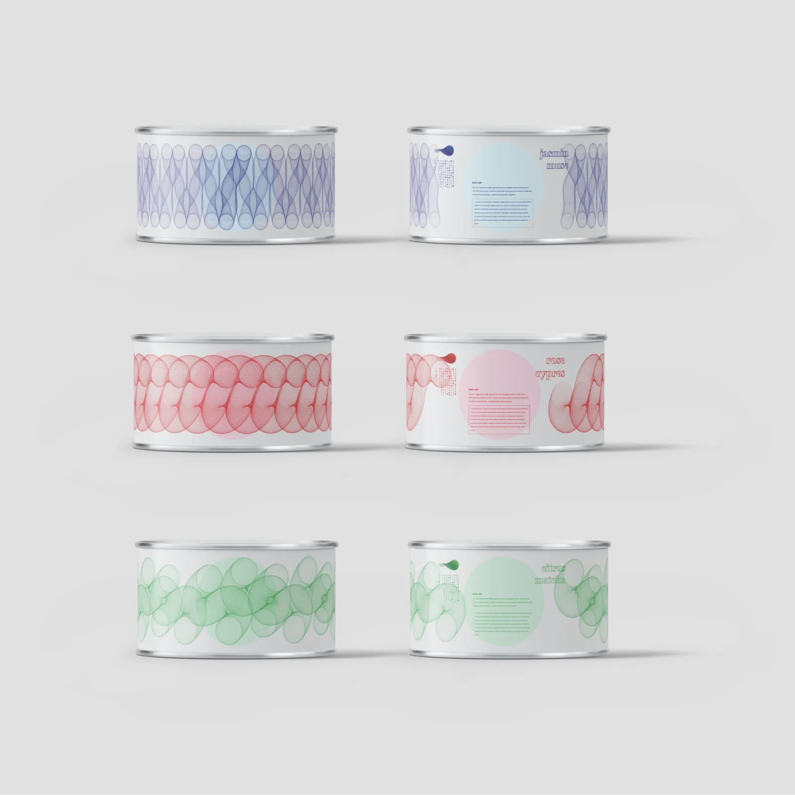
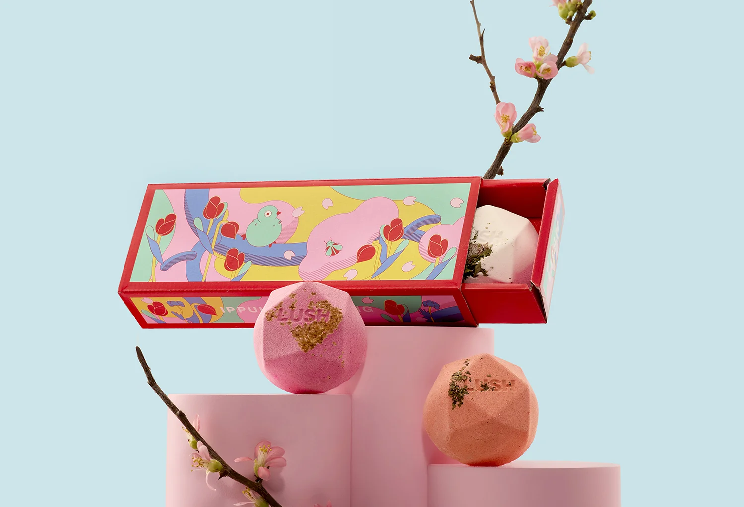
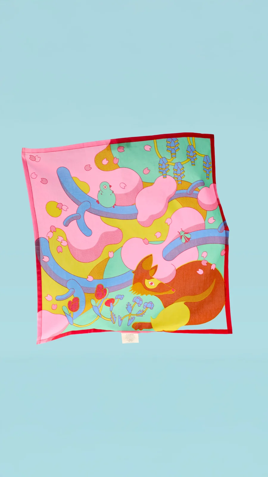
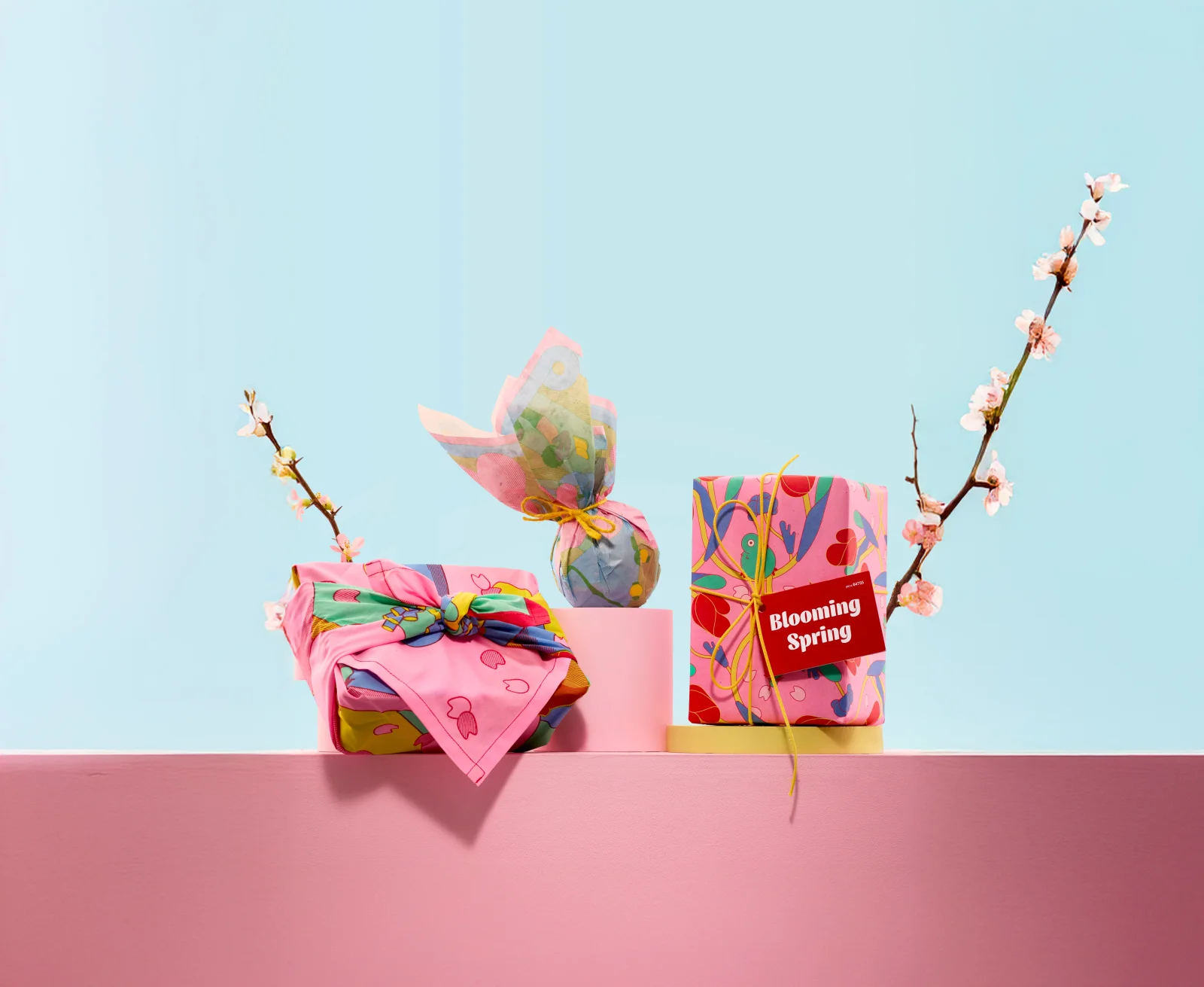
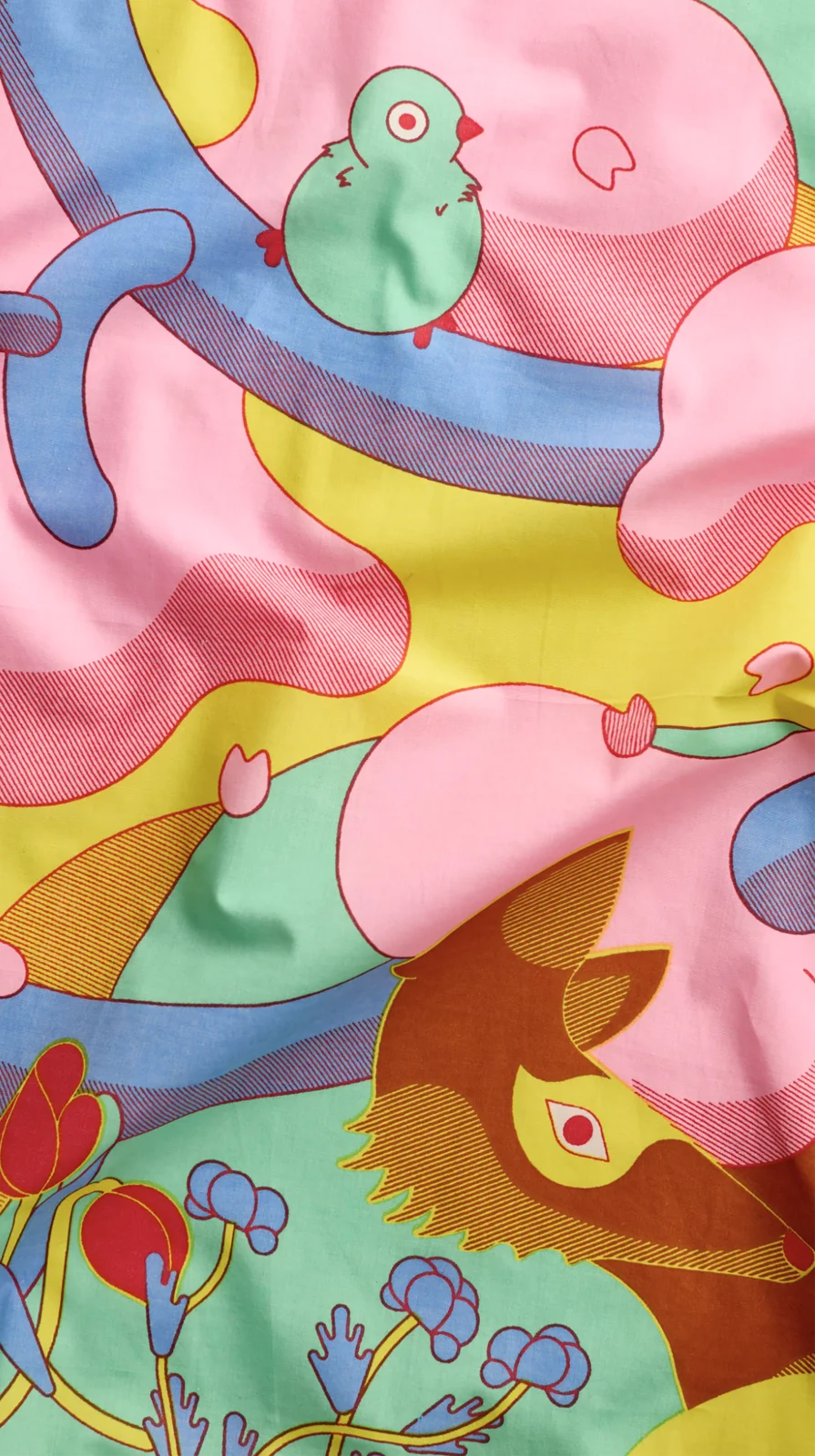
Lush 2026 Spring collection
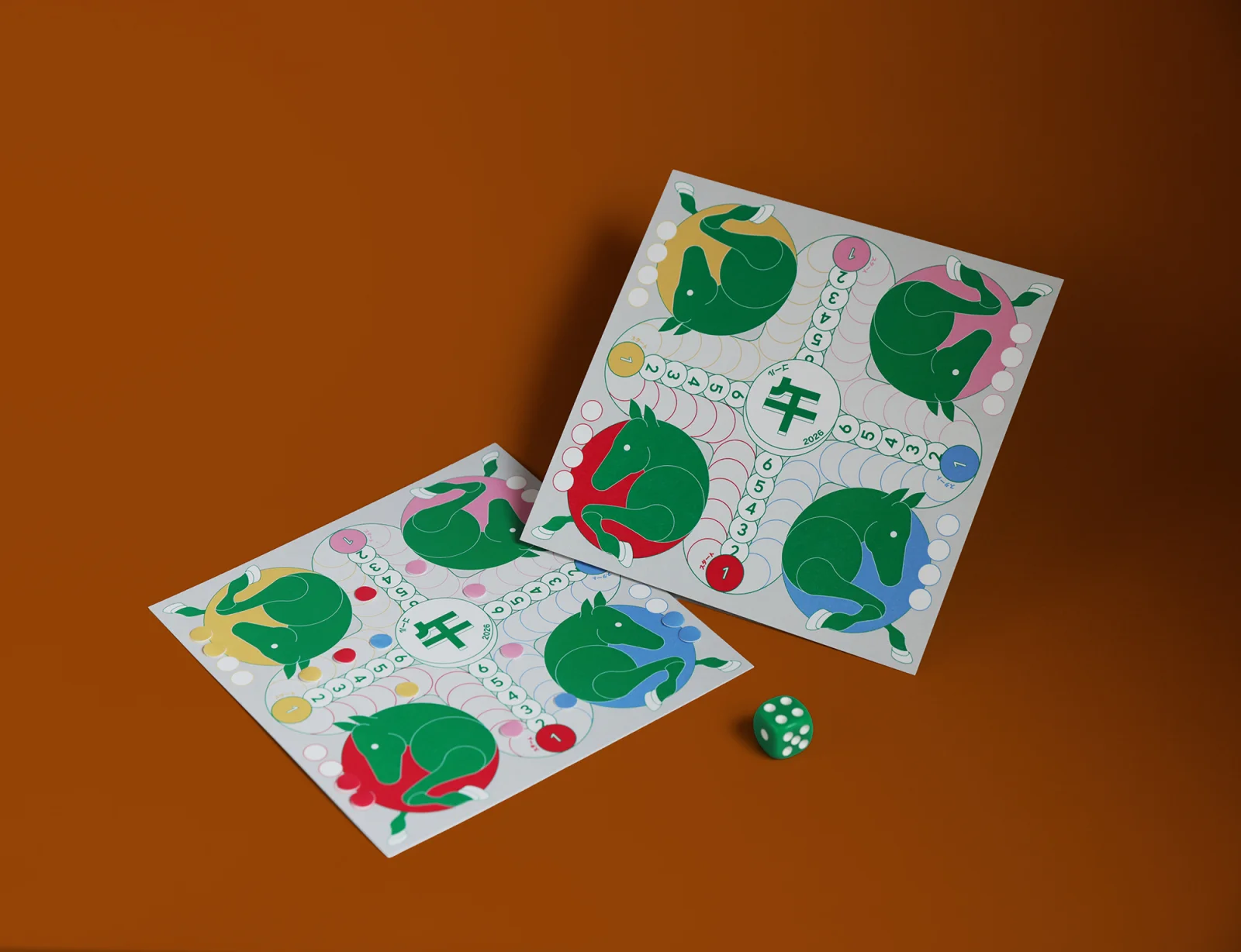
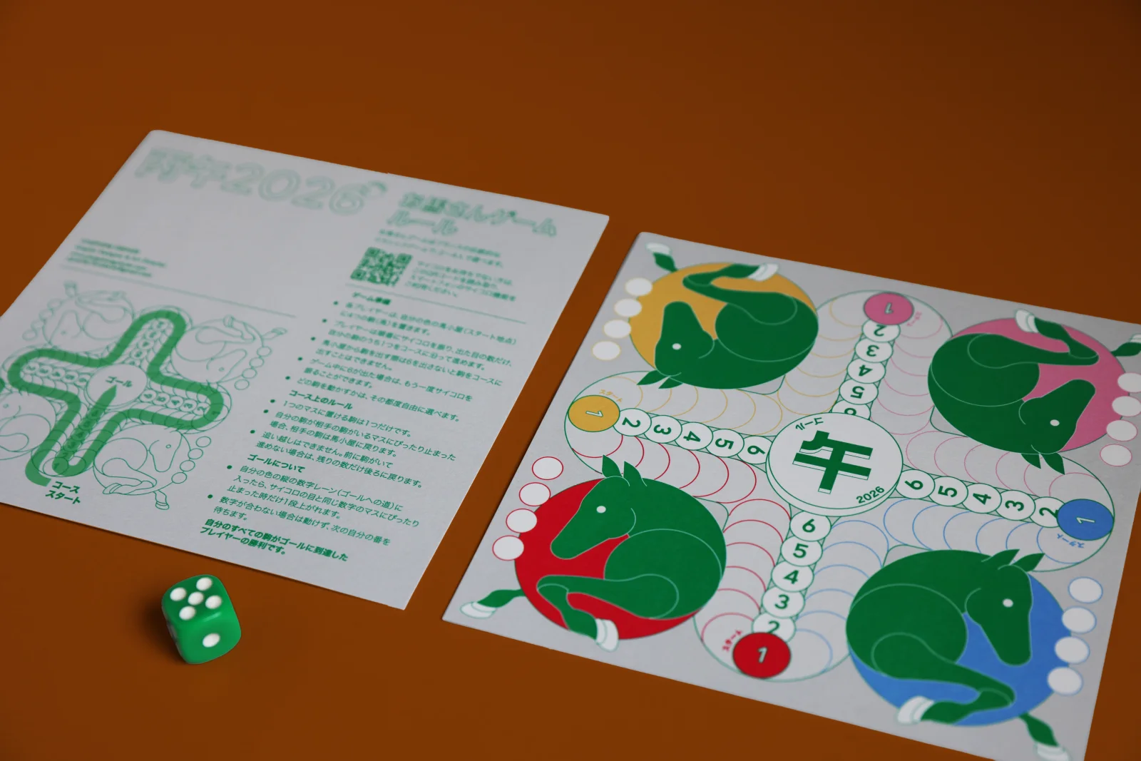
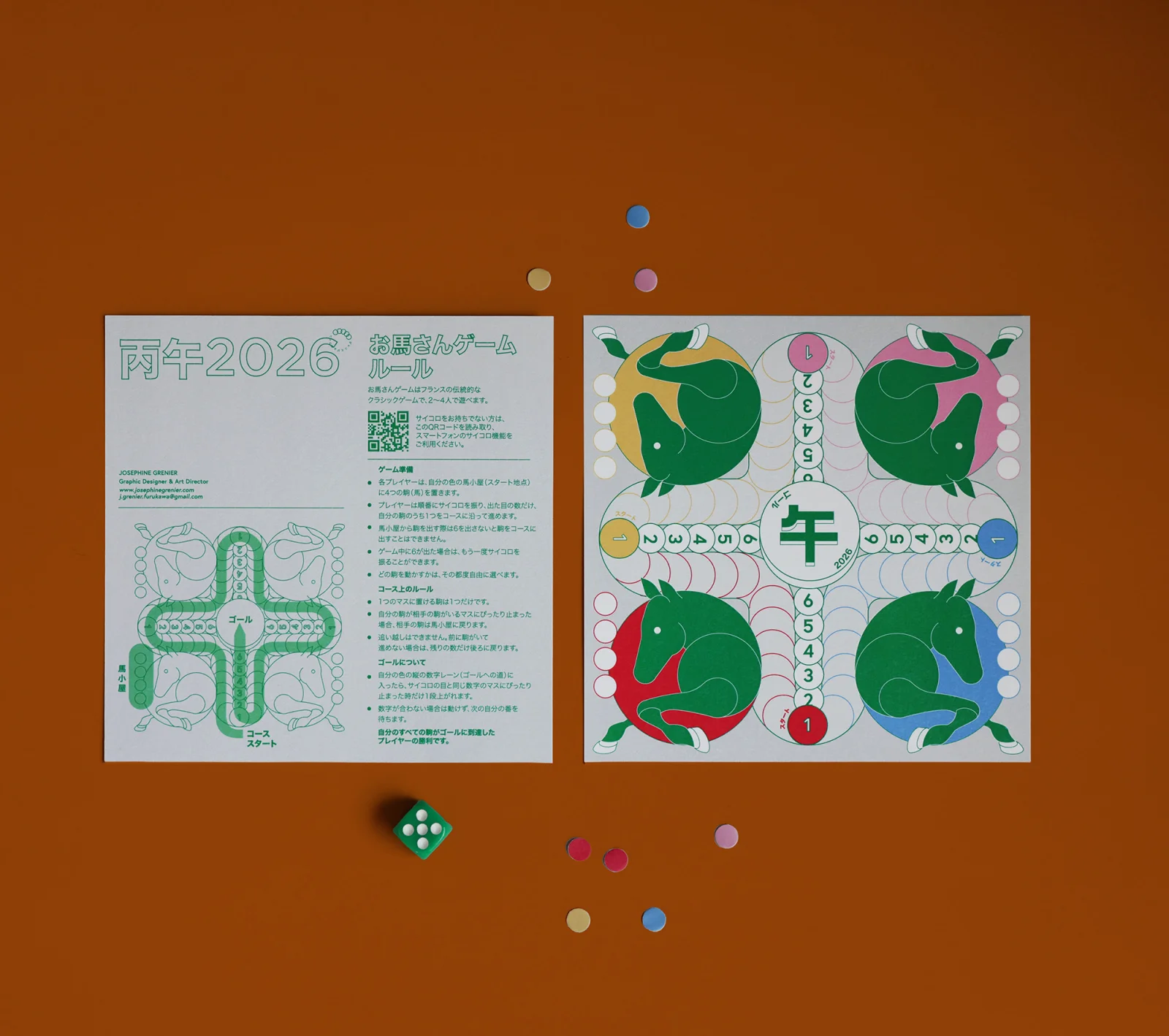
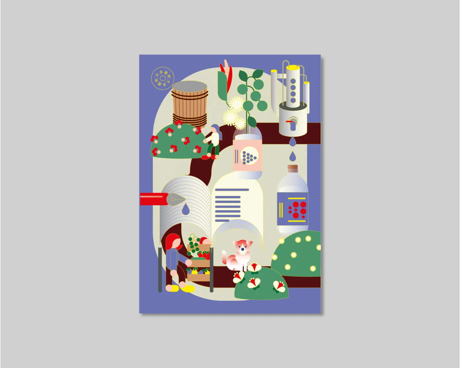
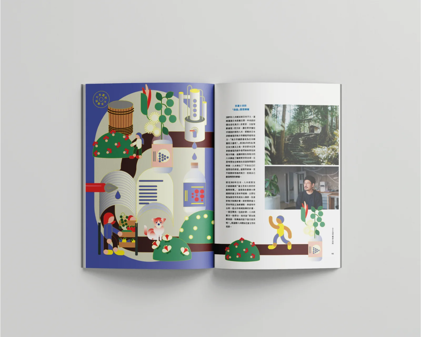
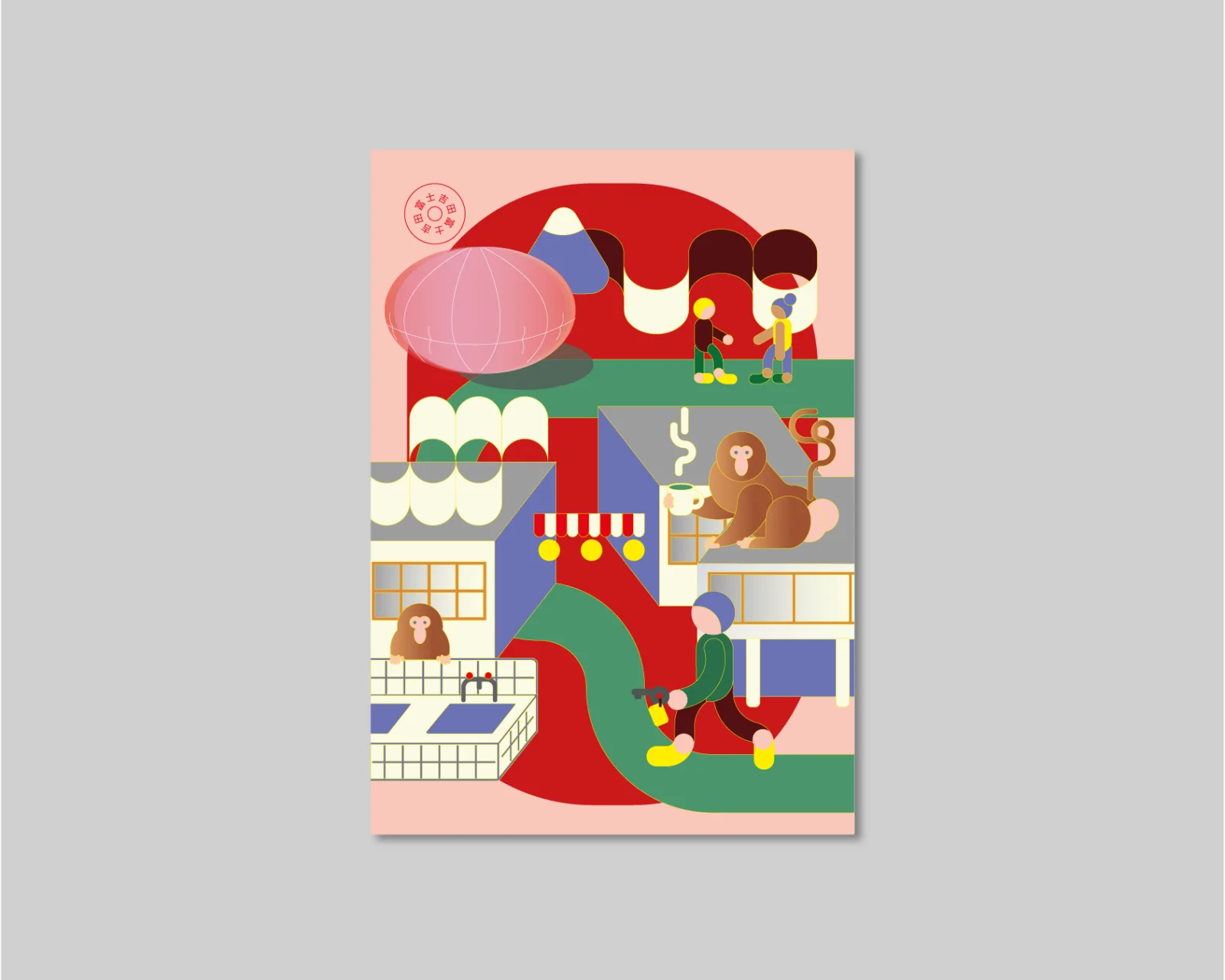
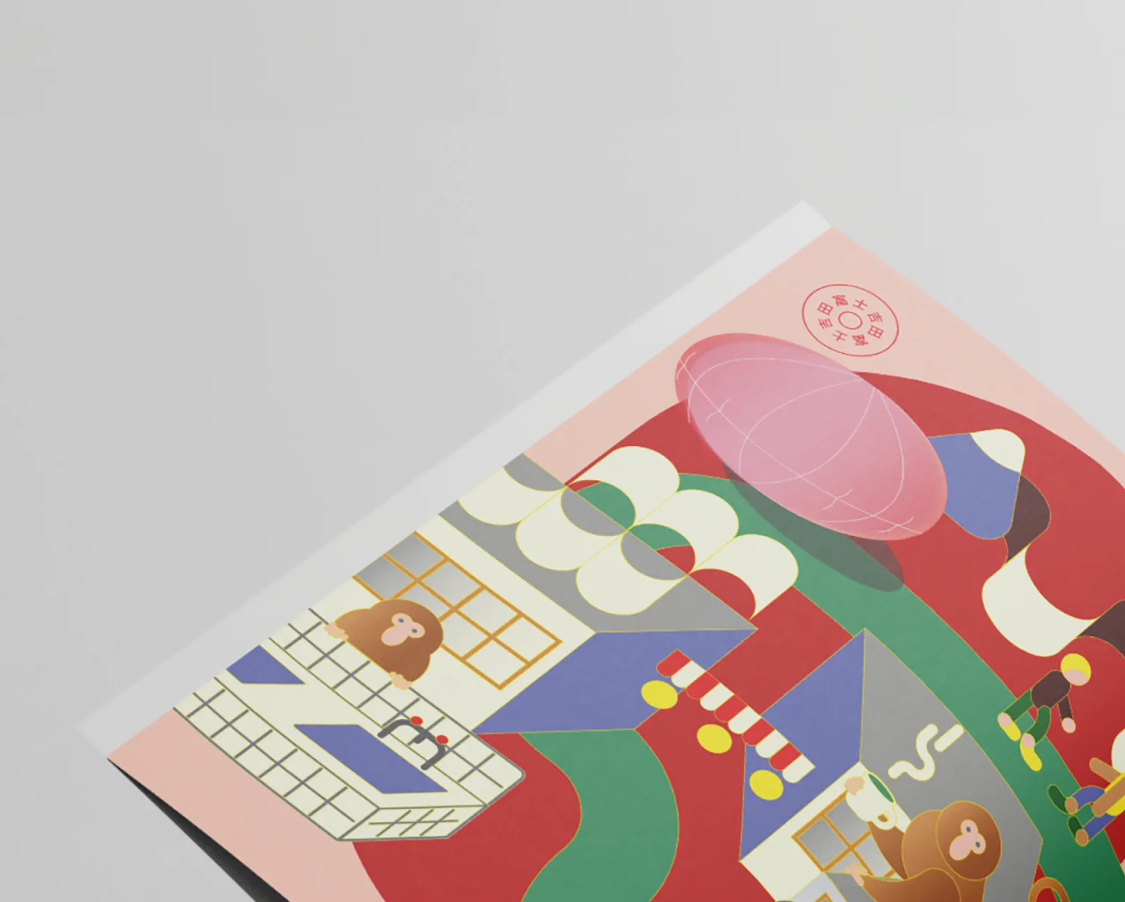
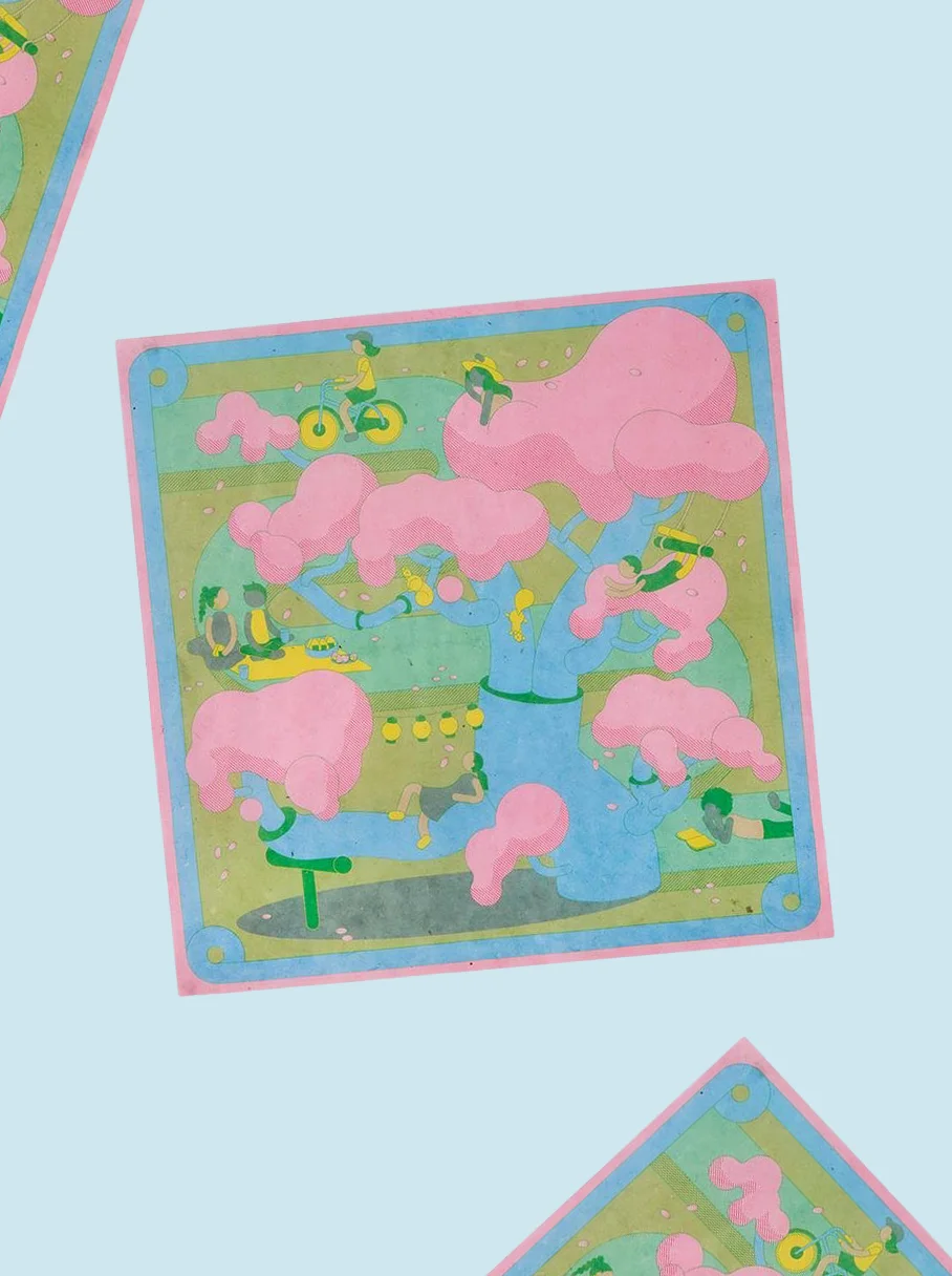
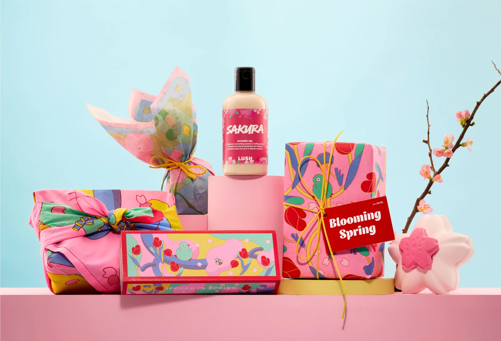
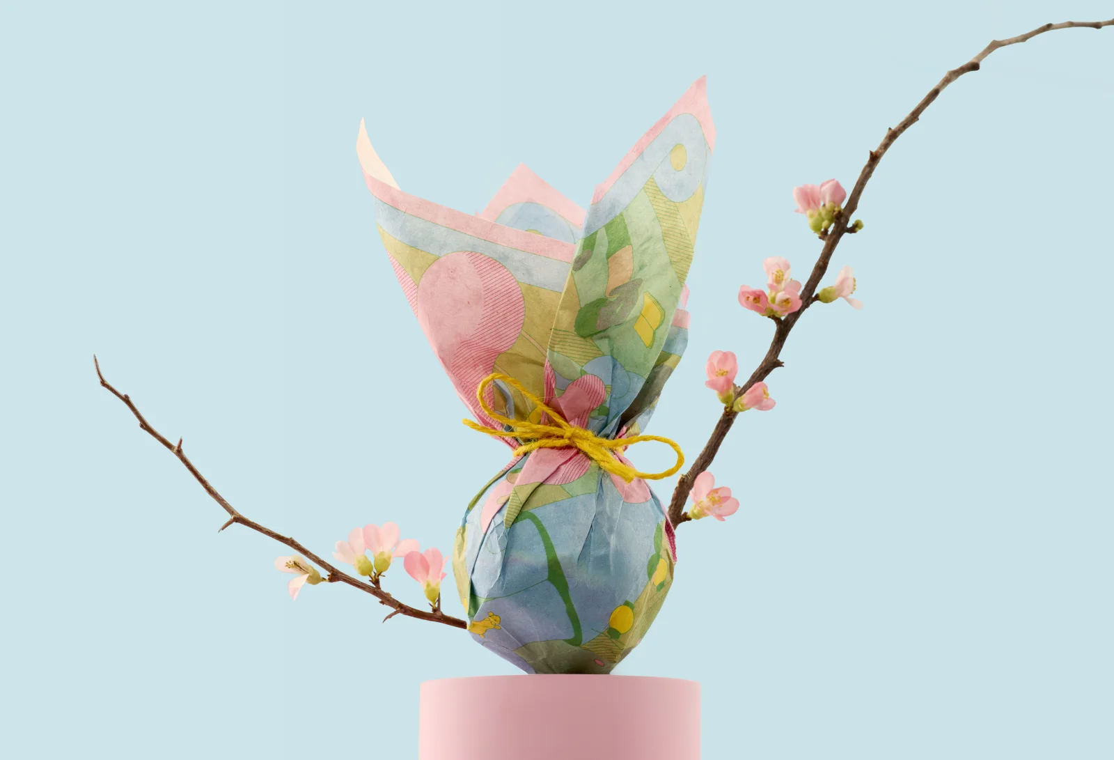
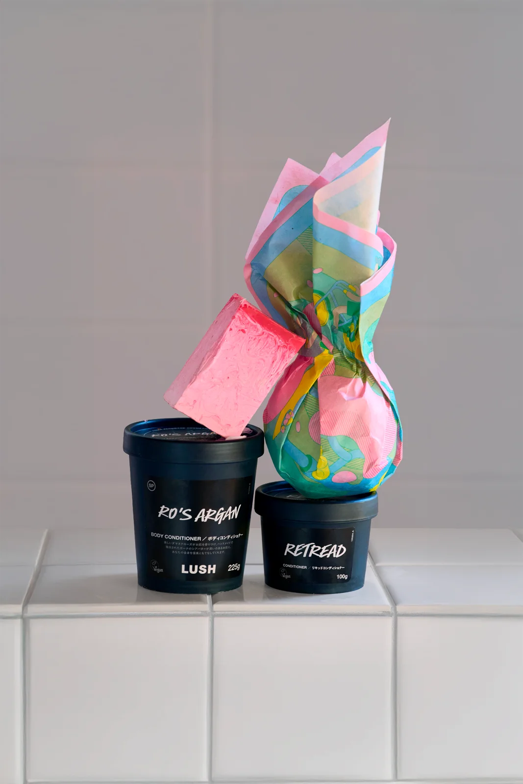
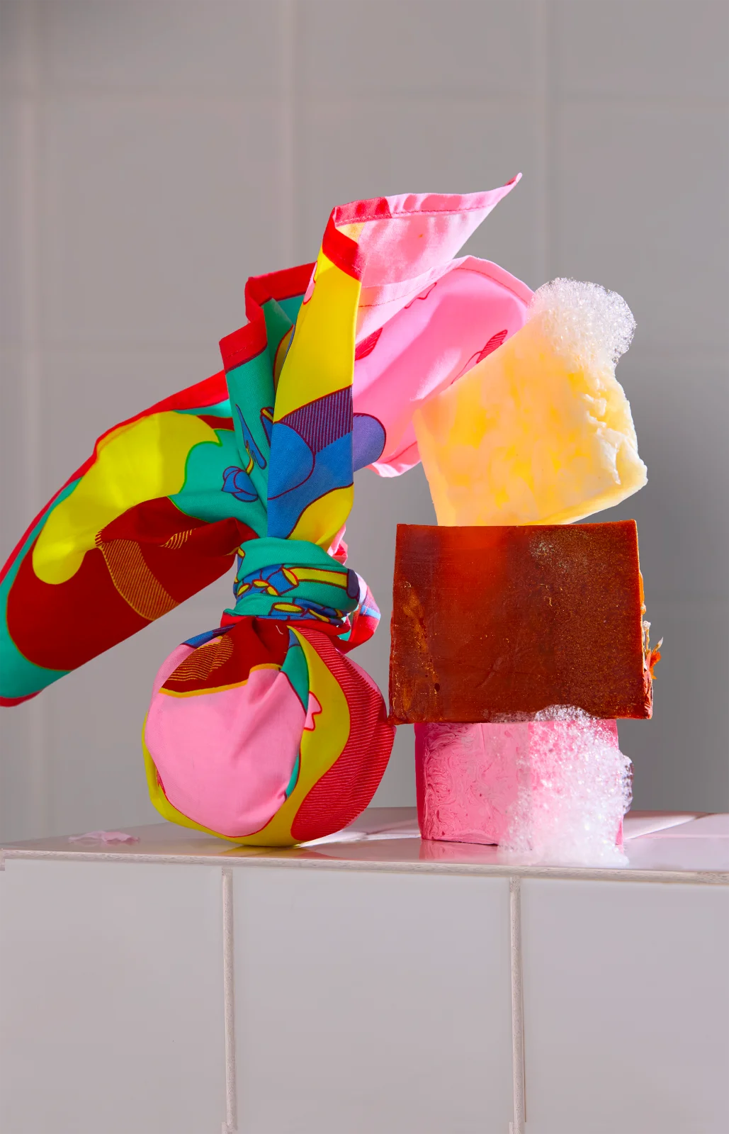
Set of Illustrations for the Spring 2026 gift collection of Lush. Two original illustrations were created and applied across multiple gift formats, including an organic cotton Knot Wrap, square gift wrap, standard wrapping paper, and a gift box featuring a set of three bath bombs. The visual concept draws inspiration from Japanese culture and its deep appreciation of seasonal cycles, particularly the fleeting beauty of cherry blossom season. The illustrations convey a soft, luminous atmosphere, expressing impermanence, quiet poetry, and a joyful attention to detail.