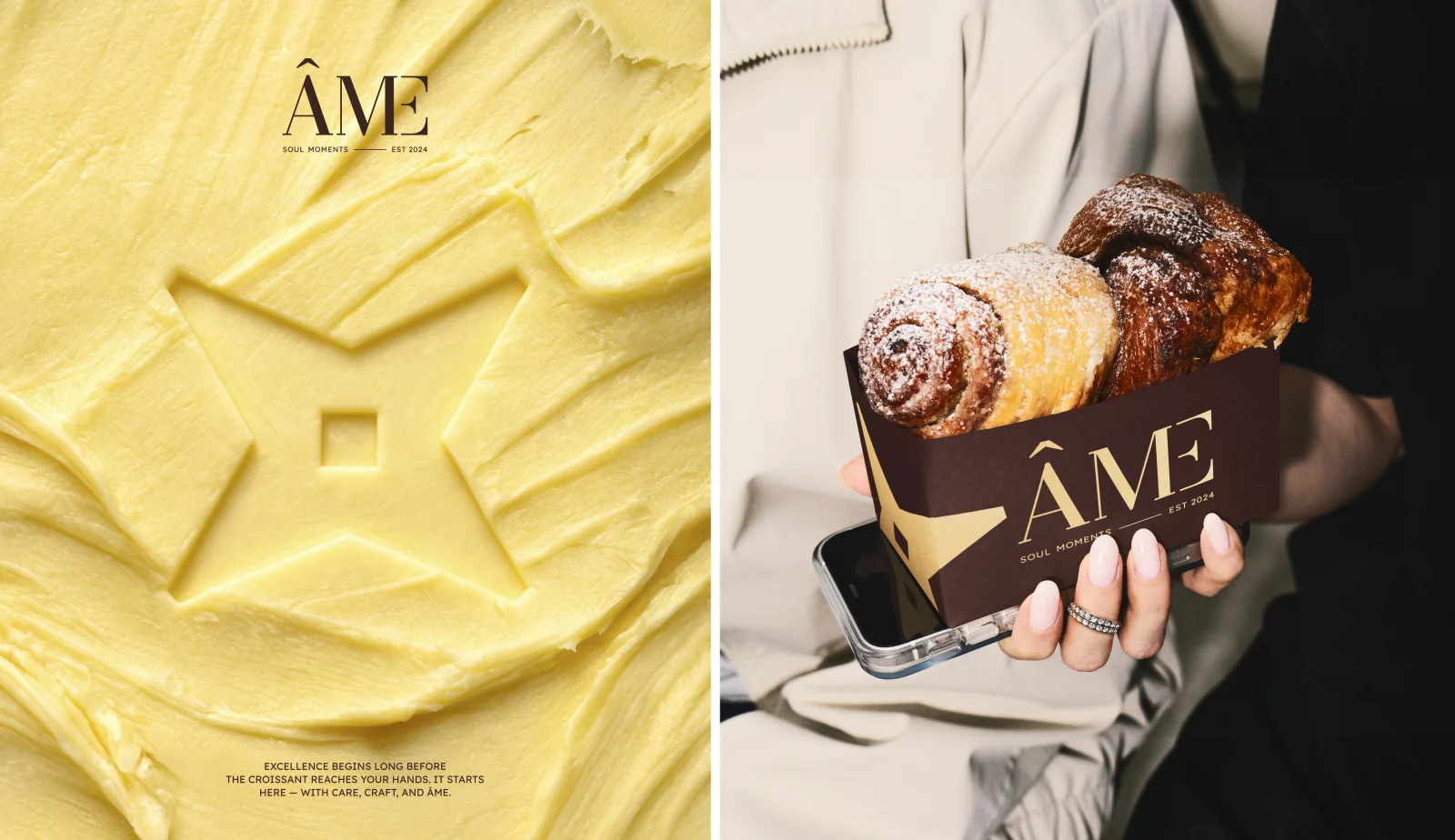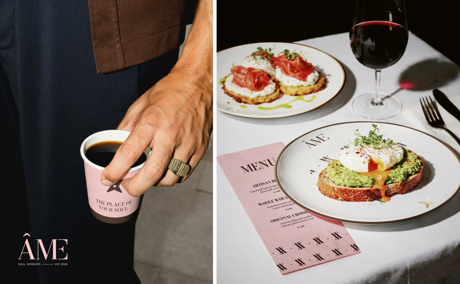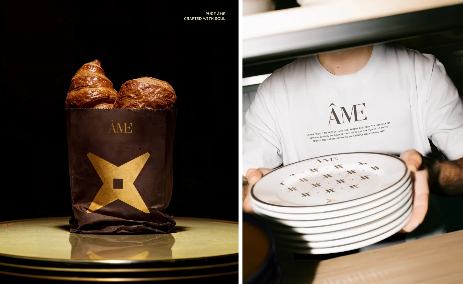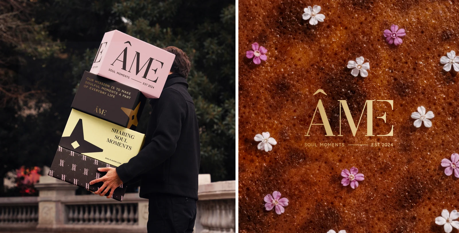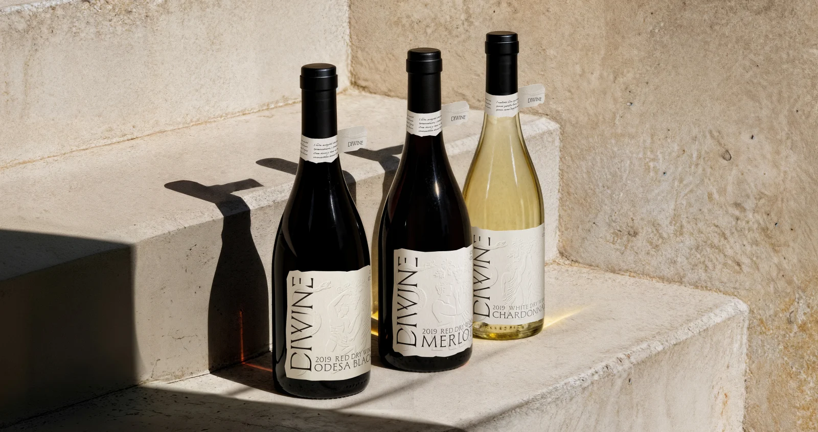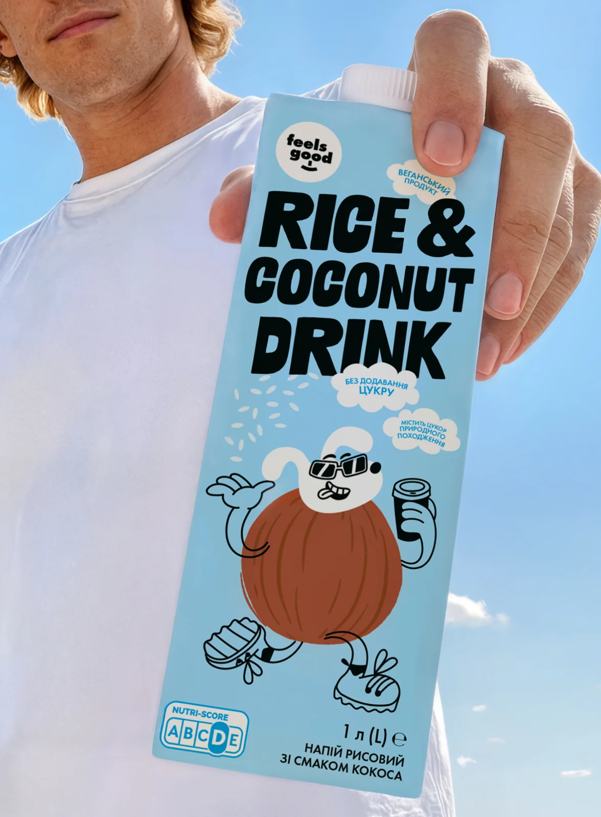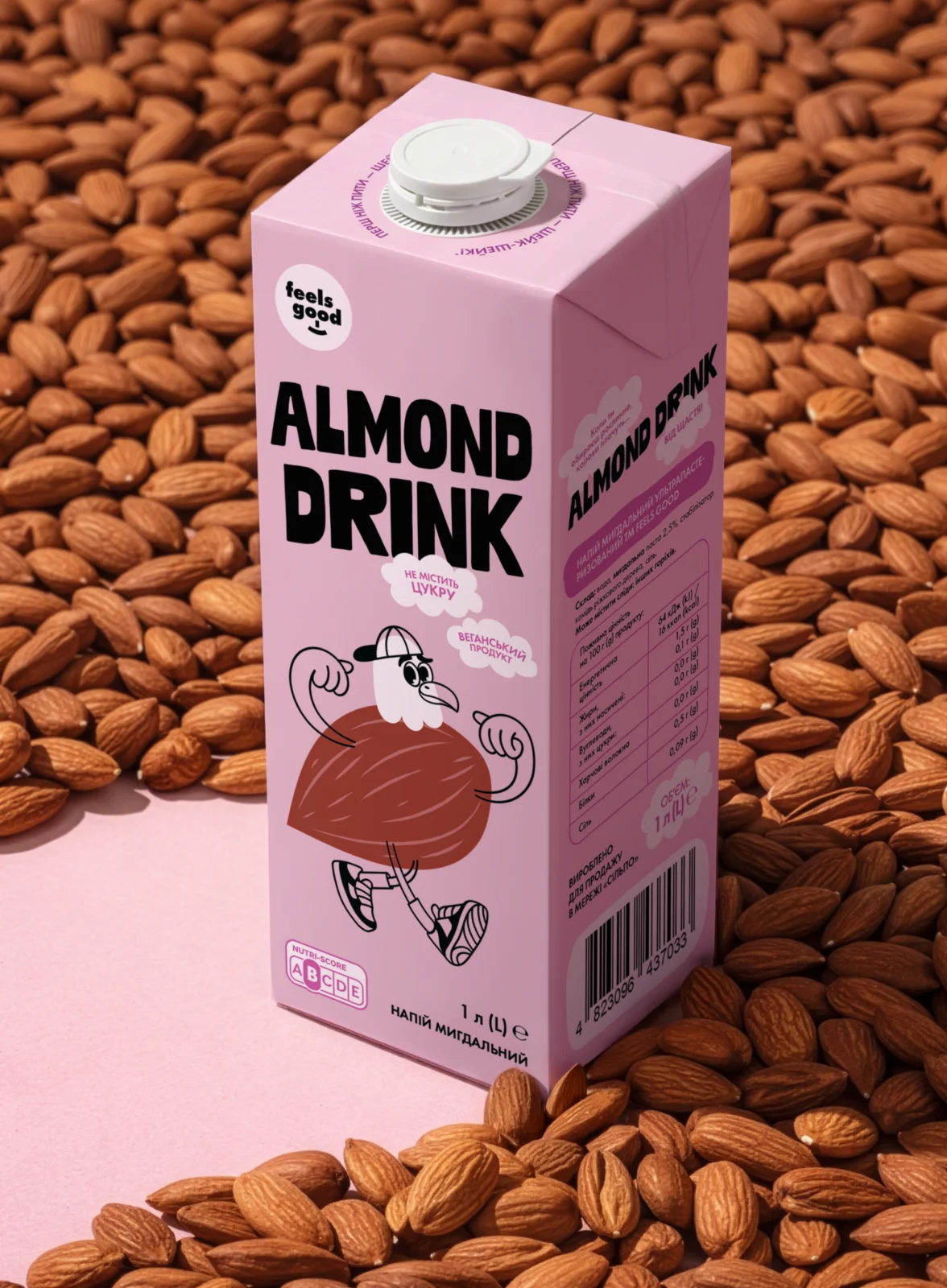
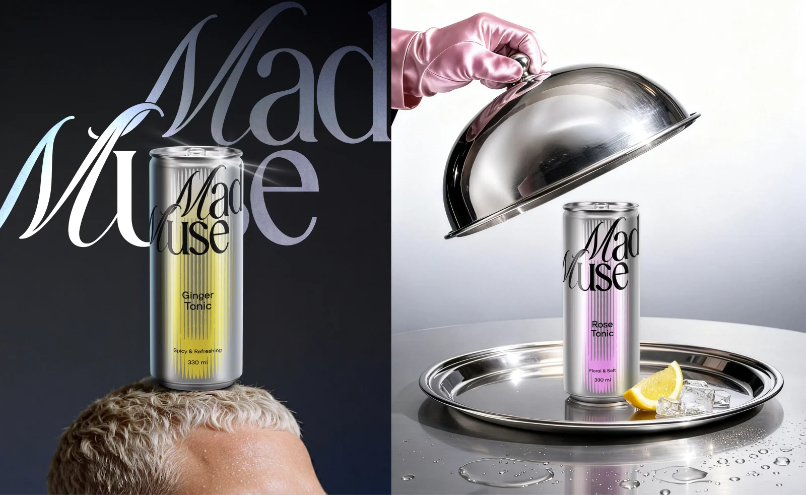
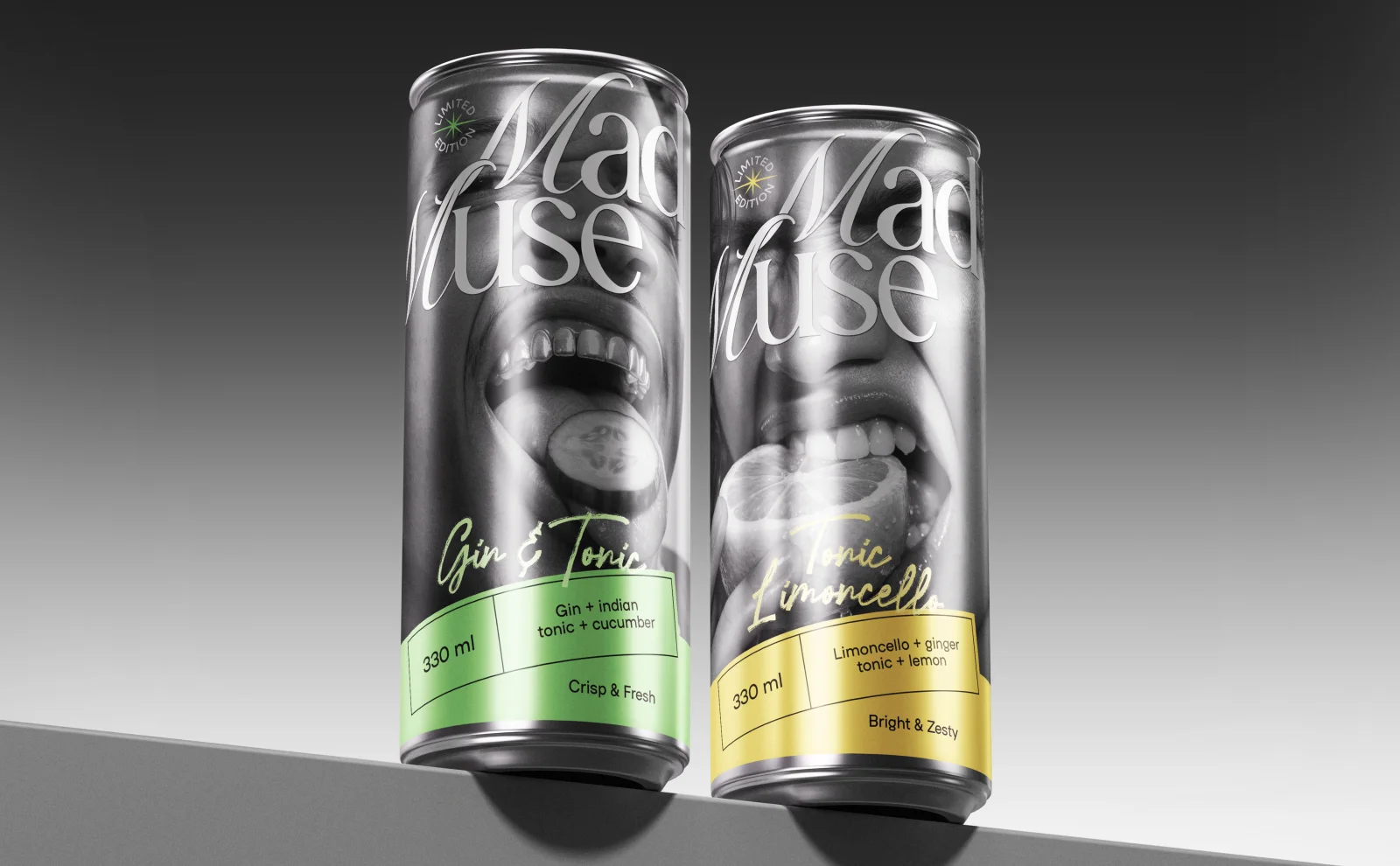
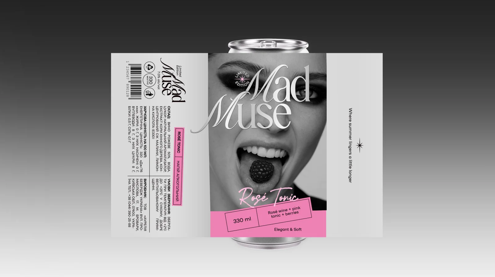
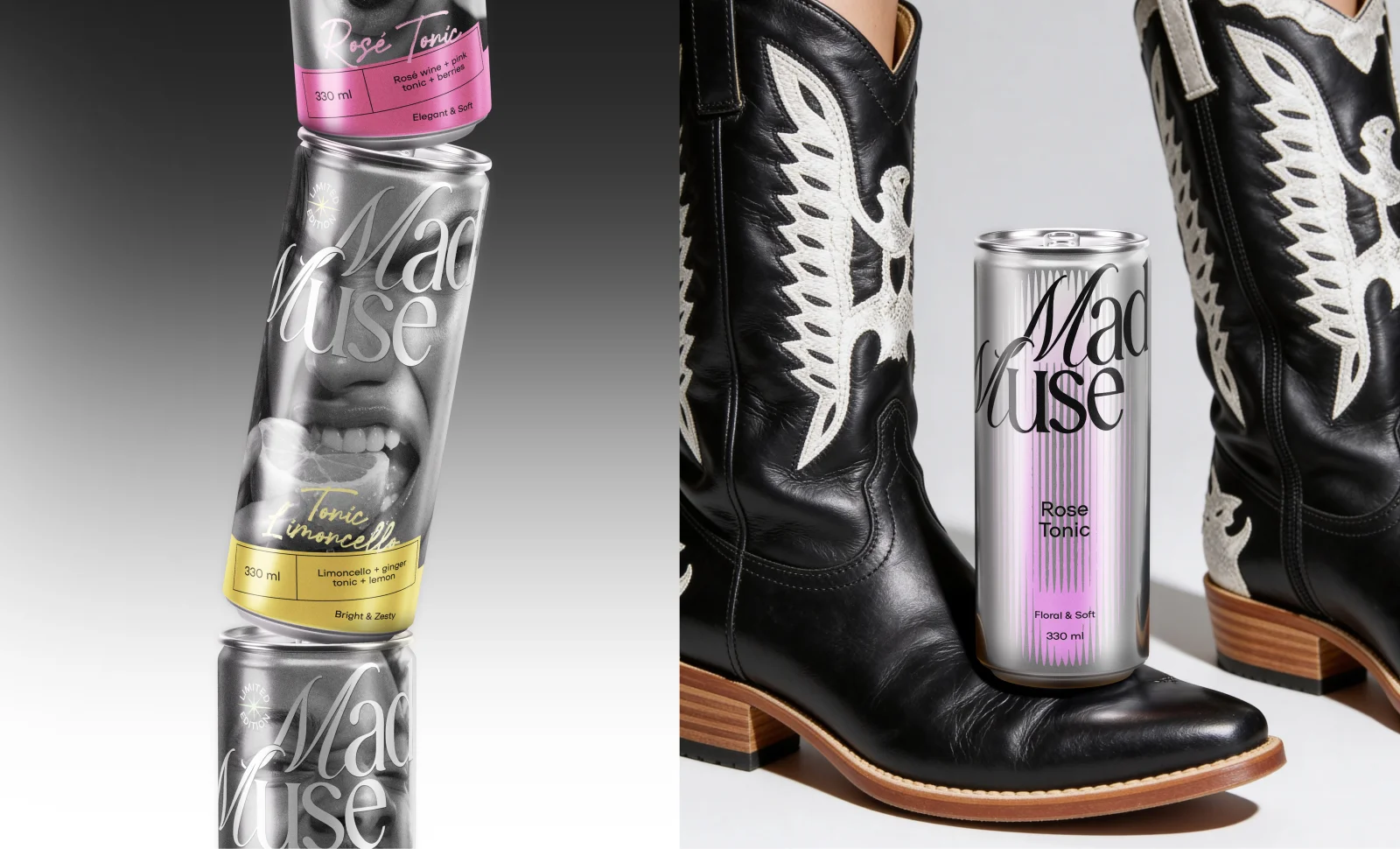
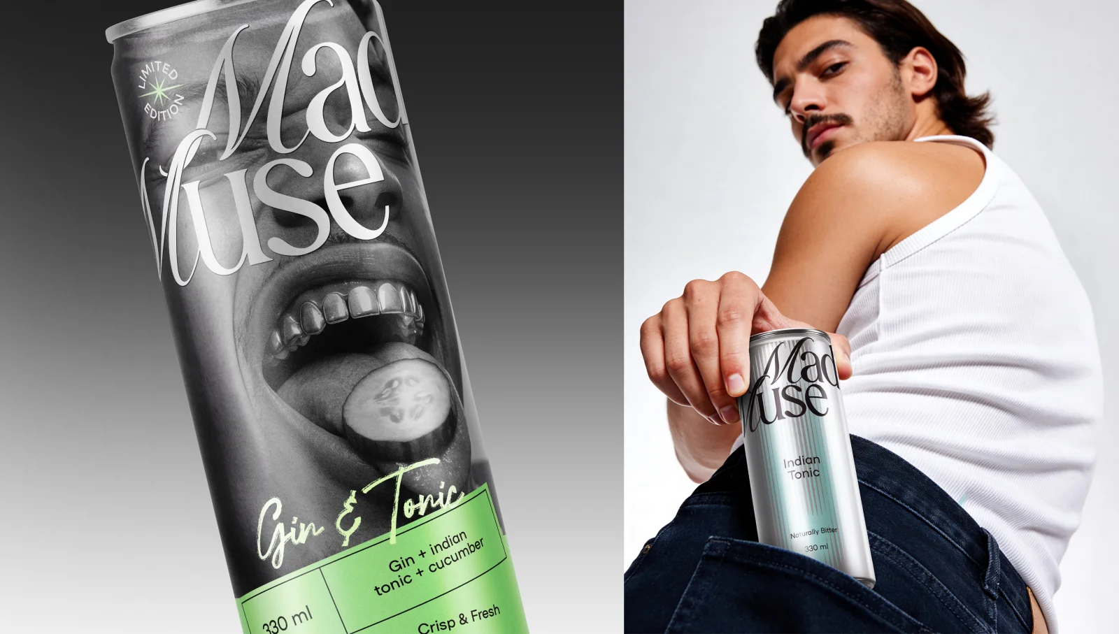
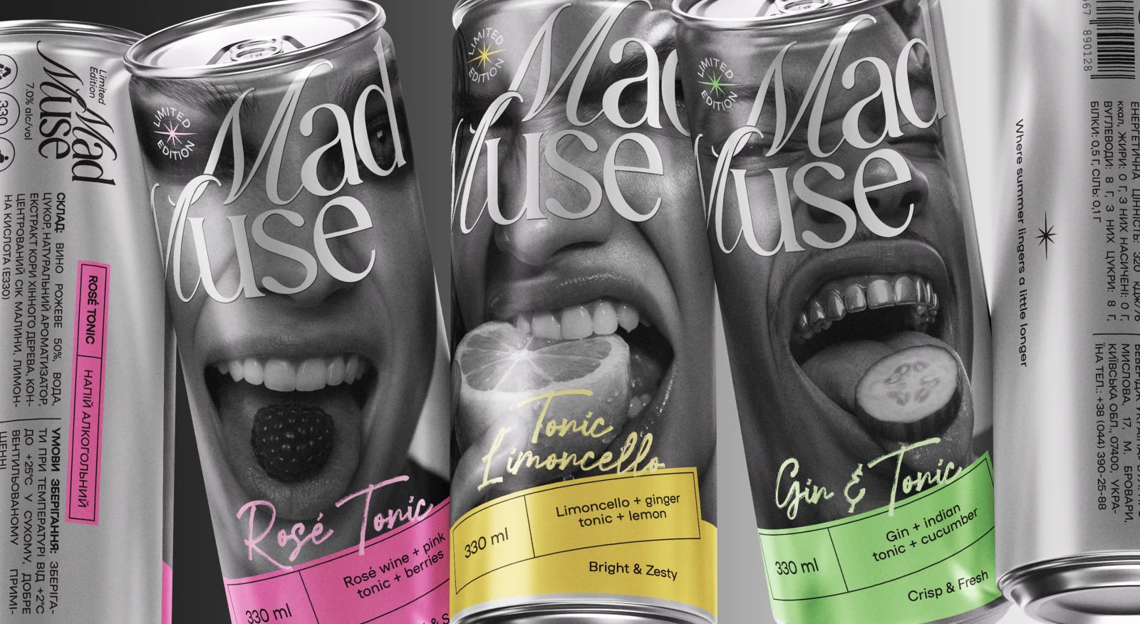
Mad Muse — Tonic & RTD Cocktail Branding
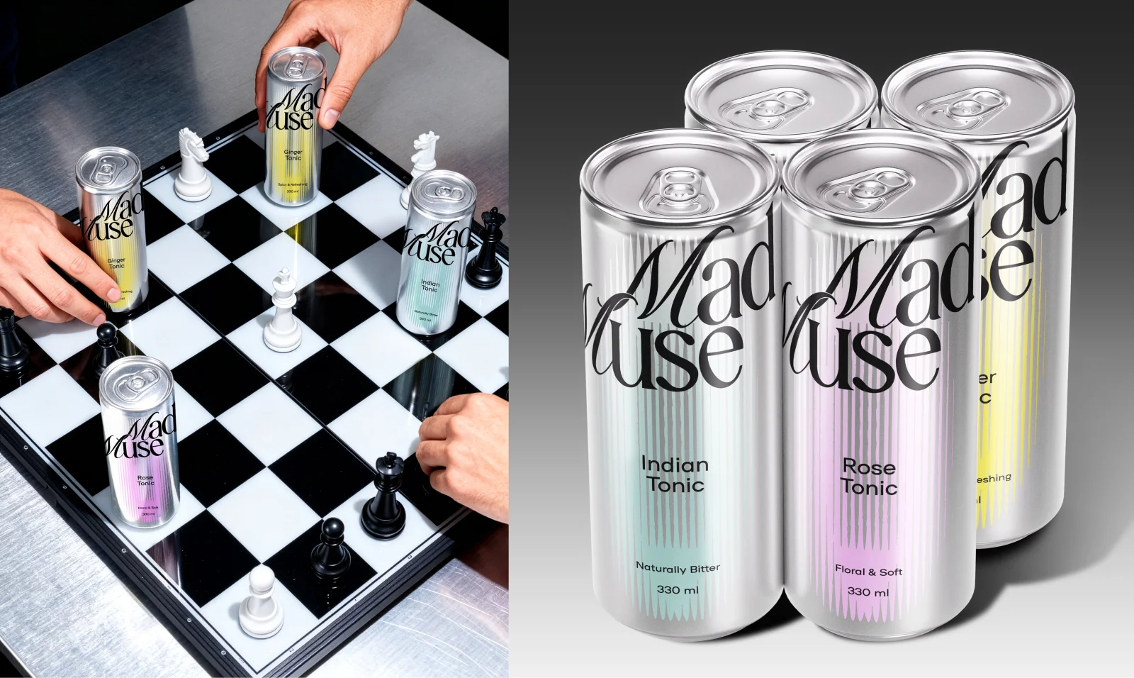
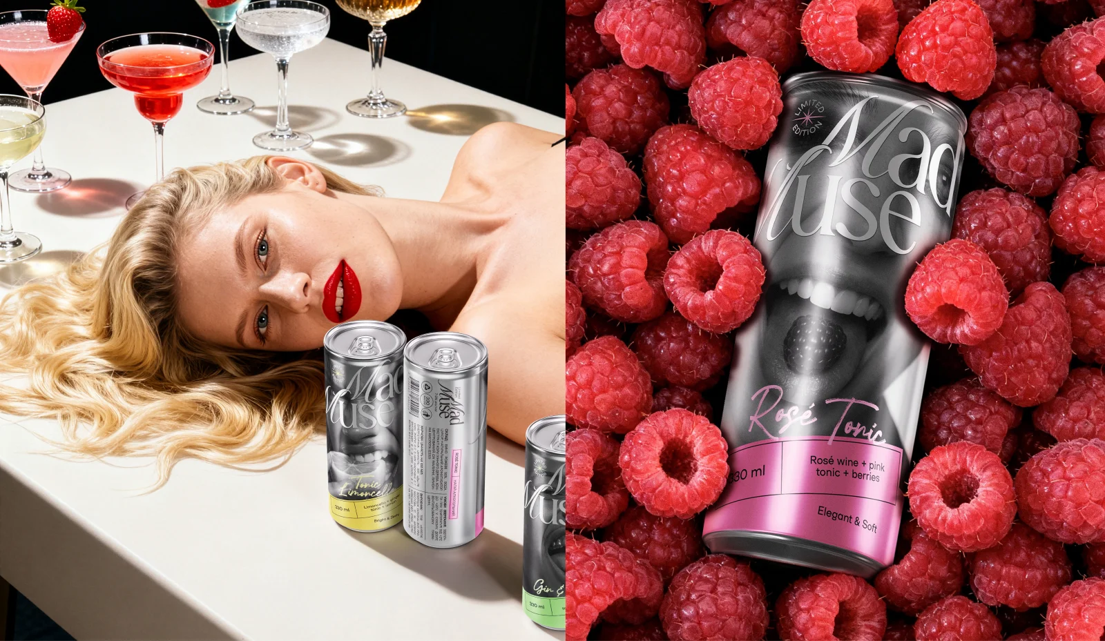
We created a brand for two lines: a core range of flavored tonics and a limited series of ready-to-drink cocktails. The challenge was to stand out in a functional, overcrowded category and bring emotion into it. Research showed that home mixology is growing, with tonic acting as a base for experimentation. This led to the idea: if tonic is the background, we’ll become the background that inspires. That’s how Mad Muse was born — a bold, rebellious muse who sparks creativity and self-expression. The core line uses a clean metallic base with abstract “auras” symbolizing moments of inspiration. Each aura is unique, with color coding for easy navigation. The limited line shifts to self-expression: the muse becomes the consumer. Bold visuals, ingredients, and color take center stage. The result is a distinctive, culturally relevant brand that challenges category norms and celebrates creative freedom.